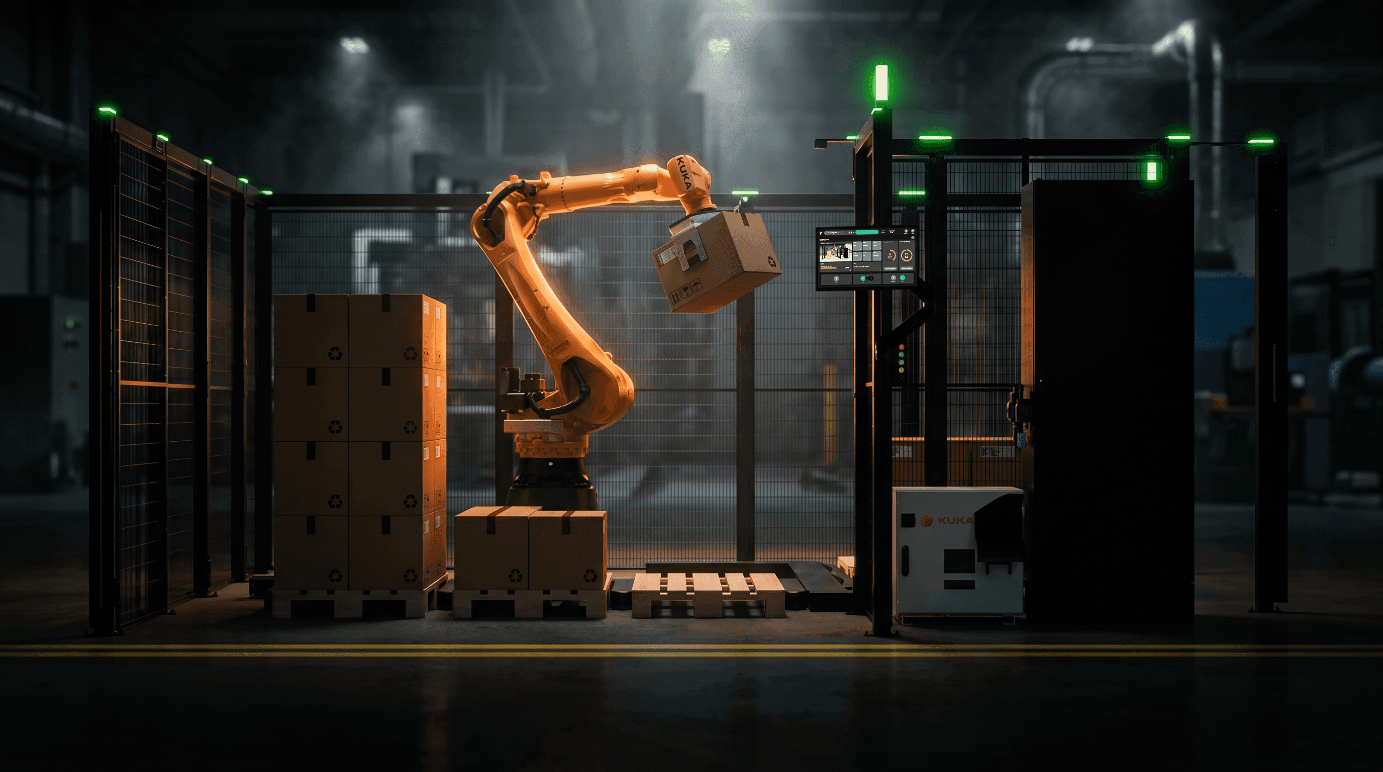
On a robot HMI, colour is a safety signal before it is a brand asset. How to keep the brand on screen without spending the colours operators need.
On a robot HMI, colour is a safety signal before it is a brand asset. Here is how to keep the brand on screen without spending the colours operators need.
A common brand guideline rule goes like this: use the primary colour for primary actions. On a website, that is good advice. On a machine HMI, it can be a small act of sabotage.
If your primary colour is yellow or red, or an orange close enough to either to be read as one, your "Start cycle" button is borrowing the visual language of a warning. If it is green, your idle screen is telling the operator everything is fine whether it is or not. The operator does not read your brand guidelines. They read the screen the way the shop floor has taught them to read panels for decades.
This is not a new problem. What is new is the speed at which it now spreads. AI design tools will take your brand library and apply it across a full set of screens in minutes. They are good at applying a palette. They have no idea that yellow on a machine means "abnormal".
My argument: in industrial HMI, colour already has an owner, and it is not the marketing department. The brand has to live somewhere else on the screen. That is not a loss. It is a better brief.
Colour on the shop floor already has an owner
Before any designer touches a robot HMI, the electrical standards have already assigned meaning to the main signal colours.
IEC 60073, the basic standard for coding indicators and actuators, gives red the meaning of danger, emergency or faulty. Yellow means warning, caution or abnormal. Green means safe or normal. Blue carries a mandatory significance. White, grey and black are the colours with no specific meaning assigned.
IEC 60204-1, the electrical safety standard for machinery, uses the same colours for actuators. Red is required for emergency stop actuators. The colour yellow is reserved for abnormal conditions. For START/ON actuators, white is the preferred colour, and red is not used. Where the same neutral colour is used for several functions, the standard asks for supplementary coding such as shape, position or symbol.
These rules are written for physical push buttons and indicator lights, and I am not claiming they dictate the hex value of your software buttons. But the operator standing at a cell has one visual vocabulary, not two. The pendant, the stack light, the panel and the touch screen all sit in the same field of view. If red means "fault" on the stack light and "brand" on the screen next to it, you have taught the operator to ignore red.

Figure 1. Signal colour meanings per IEC 60073 (as reproduced in ABB's pilot devices catalogue) and IEC 60204-1 (as summarised by Schneider Electric). The right-hand column is my recommendation, not part of either standard.
Process control learned this lesson first
ISA-101.01, the standard for human machine interfaces in process automation, was released in 2015. ISA has since added technical reports on HMI philosophy (TR101.01-2022) and on usability and performance (TR101.02-2019). As Control.com summarised it, ISA-101 tends to recommend a more monochromatic colour scheme for graphic objects, with colour used sparingly and only where attention is needed, such as alarms and abnormal equipment states. The logic is simple: when colour is rare, colour means something.
An international standard on the same topic now exists as well. IEC 63303:2024, Human machine interfaces for process automation systems, was published by the IEC on 6 August 2024, and the German edition DIN EN IEC 63303 (VDE 0810-303) is dated June 2025. Its scope, as listed for the DIN EN edition, explicitly includes discrete processes, not only continuous and batch plants. That puts robot cells and assembly lines inside the conversation, even if most robotics teams still treat HMI standards as something for refineries.
Is there evidence that this approach works? The numbers most often quoted come from vendor material, so treat them as indicative rather than final. ABB's In Control magazine (issue 01/2016) reports a study of plant operators comparing a traditional display with a high-performance HMI. With the high-performance design, operators detected abnormal situations before an alarm 48% of the time, against 10% with the traditional display. Their success rate in handling abnormal situations rose from 70% to 96%, and the time to complete those tasks fell from 18.1 to 10.6 minutes.

Figure 2. Operator results with a traditional display versus a high-performance HMI. Source: ABB, In Control 01/2016, "The key to operator effectiveness". Vendor-reported study; the study design is not published on the page.
That study is about control rooms, not robot cells. I still find the direction convincing, because the mechanism is the same: an operator scanning for trouble finds it faster when only trouble has colour.
AI design tools make the collision faster
Tools that generate interfaces from a prompt are now part of everyday design work. Figma Make is a good example because Figma documents exactly what it does with your brand. According to Figma's help centre, when you attach a library, Figma Make extracts styling CSS from it: colour palettes, typography, variables, borders and corner radius. It pulls a subset of your variables into a global CSS file with raw values, variable syntax is not preserved exactly, components themselves are not extracted, and you can use one library at a time.
Read that list with a robot HMI in mind. What reaches the model is your palette as raw values, not the reasoning behind it. If your design system never wrote down that your accent colour is forbidden on state indicators, nothing in the extraction will say so.
Figma's own documentation points at the fix. Its developer documentation on writing design system guidelines says that Figma Make needs to know how to use the tokens that specify your colours, typography, spacing and radii. The example guidelines file even includes a rule telling the model not to use brand-primary or brand-secondary as backgrounds for large areas, because they are for small accents and interactive highlights only.
That example rule is written for a generic sample design system. For an industrial HMI, the rule has to be stronger: brand colours never sit on anything that can be read as a machine state. In my view, the guidelines file is now part of your safety-relevant design documentation. If you would not let a junior designer guess at colour semantics, do not let a model guess either.
The Machinery Regulation raises the bar for clarity
Regulation (EU) 2023/1230 on machinery replaces the Machinery Directive and applies from 20 January 2027. That is roughly three months away.
The regulation does not mention brand colours, and I will not pretend it does. What it does say is useful as a design brief. Annex III, section 1.2.2 requires control devices to be clearly visible and identifiable, using pictograms where appropriate. Section 1.7.1.1 requires control information to be unambiguous and easily understood, and not so excessive that it overloads the operator. Interactive displays and controls must be easily understood and easy to use. Section 1.7.1.2 requires warning devices to be unambiguous and easily perceived.
My reading as a designer, not a lawyer: "unambiguous" is hard to argue for when the same accent colour appears on the logo, the start button and the warning banner. Ask your safety engineer how they would defend it. Their answer usually ends the debate.
Colour cannot carry meaning alone anyway
There is one more reason to stop leaning on colour. A 2025 review in the journal Healthcare puts red-green colour vision deficiency at up to 8% of males and 0.5% of females of Northern European ancestry. On a shift of a dozen operators, it is entirely possible that someone reads your red and green as close to the same thing.
That is why the IEC 60204-1 idea of supplementary coding matters on screens too. State should always be carried by at least two channels: colour plus an icon, a shape, a position or a label. Once you design state that way, colour becomes a reinforcement rather than the only signal, and the pressure to fill the screen with colour disappears.
Where the brand lives instead
So what is left for the brand? Quite a lot, and most of it is stronger than a hex value.
Typography. A distinctive, highly legible typeface used with a strict type scale is recognisable at a glance and does not compete with alarms.
Layout and grid. A consistent screen architecture, the same header, the same navigation logic, the same placement of the cell status, is a brand experience operators feel every shift.
Iconography. A custom icon set with a consistent stroke, corner and perspective language is one of the most ownable assets in industrial UI.
Motion. How panels open, how a job progresses, how a confirmation lands. Motion is brand, and it can be calm.
Microcopy. The tone of an error message is brand. "Gripper did not close. Check part position, then press Retry" says more about a company than any colour.
Neutral palette. The specific greys, their temperature and their contrast steps can be as recognisable as an accent colour.
Brand moments. Splash screen, login, idle and screensaver states, and the "about" panel can carry the full brand colour, because no machine state is shown there.

Figure 3. A two-layer token model: brand tokens and state tokens are separate, and the AI guidelines file encodes the rule between them. Author's framework.
The same thinking has to travel beyond the screen. When a product render, a trade-fair demo or an LED wall shows a simulated HMI where a brand-coloured button starts a cycle, that image teaches buyers your product's visual language before an operator ever touches it. Keep marketing renders and demo screens on the same state semantics as the shipped software.
A practical method: two palettes, one brand
The checklist I run on any robot HMI or demo screen, with or without AI in the workflow.
Split the tokens. Create two token groups: brand (accent, neutrals, type, radius, motion) and state (fault, warning, normal, mandatory, info). Name them by meaning, never by hue.
Map state to IEC 60073. Fault and emergency use red, warning and abnormal use yellow, normal uses green, mandatory actions use blue. Document the mapping in the design system, not only in someone's head.
Audit the brand hue. If your brand accent sits in the red, yellow, green or blue family, or close to it (in my view, orange is too easily read as a warning), restrict it to brand moments and non-interactive decoration. If it does not, you have more freedom, but it still never marks a state.
Make actions neutral by default. Primary actions get weight, size, position and an icon, not a signal colour. On physical actuators, white is the preferred colour for START for a reason.
Write the rule for the machine. Put the brand versus state rule in the guidelines file your AI tools read, in plain imperative language. Test it: prompt the tool to build an alarm screen and check what it does.
Run a greyscale and colour vision test. Desaturate every screen. If you cannot tell normal from abnormal, state depends on colour alone. Then run a red-green deficiency simulation.
Extend the check to marketing. Review renders, demo videos, trade-fair screens and LED wall content against the same state rules before approval.

Figure 4. AI-generated illustration. The greyscale test in practice: if state is still readable without colour, colour is doing its job as reinforcement.
Conclusion
I love strong brands, and robotics needs more of them, not fewer. But on the machine, the brand's job is to make the operator faster and more confident, not to be seen. A calm, mostly neutral HMI with a recognisable type system, iconography and voice is a stronger brand than a screen painted in the logo colour.
AI design tools will apply whatever rules you give them, at a speed no review process can match after the fact. So give them the right rule up front: in industrial HMI, colour belongs to the machine's state. The brand gets everything else.
Sources
ABB pilot devices catalogue, colour coding per IEC 60073: https://resources.ipd.com.au/Flipbook/ABB_Pilot_Devices%20_Catalogues/files/basic-html/page148.html
Schneider Electric FAQ, pushbutton colours per IEC 60204-1: https://www.se.com/uk/en/faqs/FA28043/
Control.com, "Going Gray: A New HMI Standard" (2020): https://control.com/technical-articles/going-gray/
ISA, ISA-101 standards overview: https://isa.org/standards-and-publications/isa-standards/isa-101-standards
IEC webstore, IEC 63303:2024: https://webstore.iec.ch/en/publication/66298
DIN Media, DIN EN IEC 63303 (VDE 0810-303):2025-06: https://www.dinmedia.de/en/standard/din-en-iec-63303/388767511
ABB, In Control 01/2016, "The key to operator effectiveness": https://new.abb.com/power-generation/in-control/01-2016/the-key-to-operator-effectiveness
Figma Help Center, bring style context from a Figma Design library into Figma Make: https://help.figma.com/hc/en-us/articles/33024539096471
Figma Developer Docs, write design system guidelines for Make kits: https://developers.figma.com/docs/code/write-design-system-guidelines/
EU-OSHA, Regulation (EU) 2023/1230 on machinery: https://osha.europa.eu/en/legislation/directive/regulation-20231230eu-machinery
EUR-Lex, Regulation (EU) 2023/1230: https://eur-lex.europa.eu/eli/reg/2023/1230/2023-06-29
Almustanyir, A., "A Global Perspective of Color Vision Deficiency", Healthcare 2025, 13(16), 2031: https://www.mdpi.com/2227-9032/13/16/2031
Images (download from the review page: https://claude.ai/artifact/GzaZBdKck4Angr7d1dAHzS)
hero.png: AI (Gemini 3 Pro Image, 2K), 1920 x 1080, no text, first generation passed inspection. Prompt above.
linkedin.png: AI (Gemini 3 Pro Image, 2K), 1080 x 1080, no text, first generation passed inspection. Prompt above.
fig-1.png: coded (matplotlib), 1600 x 820. Caption: Figure 1 above.
fig-2.png: coded chart (matplotlib), 1600 x 720, only ledger numbers (C8). Caption: Figure 2 above.
fig-3.png: coded diagram (matplotlib), 1600 x 840. Caption: Figure 3 above.
fig-4.png: AI illustration (Gemini 3 Pro Image), 1600 x 893. Caption: Figure 4 above. Prompt: Photorealistic editorial scene in a bright modern industrial workshop: a UX designer seen from over the shoulder holds a tablet showing an abstract interface made only of calm grey rectangles and one small amber shape, comparing it with a desaturated grey version on a laptop on a workbench. Hands natural and correct. Muted neutral palette with one amber accent, soft daylight. No text, no letters, no numbers, no logos, no watermarks, no signage, no robot arms, no grippers, no robot cells. No readable screen content, no glyphs, no safety equipment.
[Leon render] notes: Optional: a demo HMI screen in a neutral palette with state colours only, for the video's "beyond the screen" segment and as an alternative to fig-4.
Fact-check log
Independent adversarial subagent re-opened all 12 source URLs. First pass flagged 13 items; all fixed. Second pass: UNSUPPORTED COUNT 0.
Changed or removed:
Removed claim that IEC 63303 is "the international version" of ISA-101 (no source links them). Now "an international standard on the same topic".
Removed "written for a consumer product" about Figma's example rule; now "a generic sample design system".
Orange: removed implication that standards cover orange; now framed as author's view.
Removed "amber" from the IEC 60073 mapping (source says yellow).
Removed "IEC 60204-1 builds on IEC 60073" (unsourced); now "uses the same colours for actuators".
LinkedIn: "Process control fixed this" changed to "moved to"; ABB figures now labelled vendor-reported and attributed to a high-performance HMI (not grey alone).
Video script: mechanism claim reframed as opinion; ISA-101 wording softened to "tends to favour"; regulation tense corrected; ABB labelled as a vendor.
"Figma clearly knows this" removed.
Removed two first-person anecdote phrasings (brand books "I have seen", renders "I see") as unverifiable.
Ledger C3, C8, C14 passages corrected to verbatim source wording.