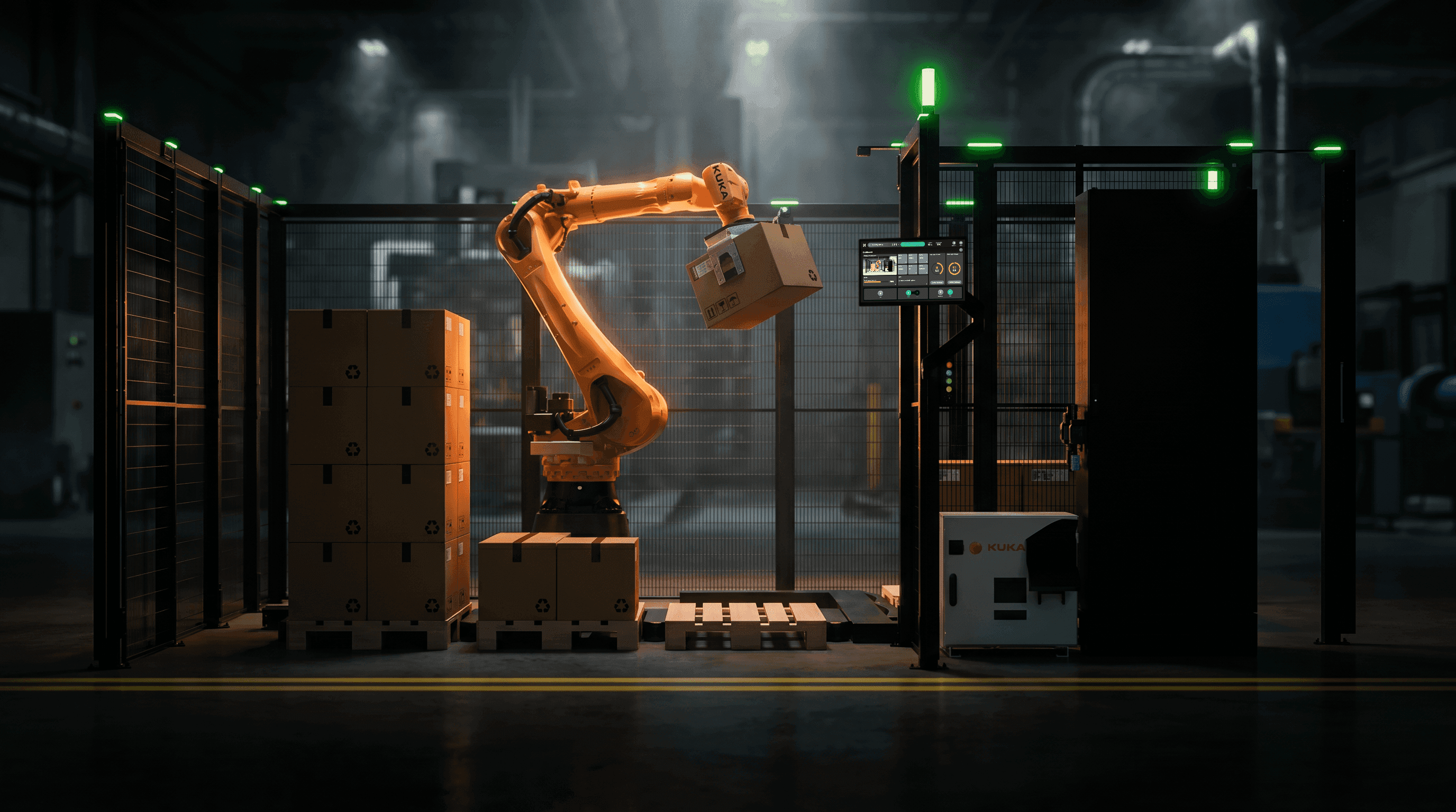
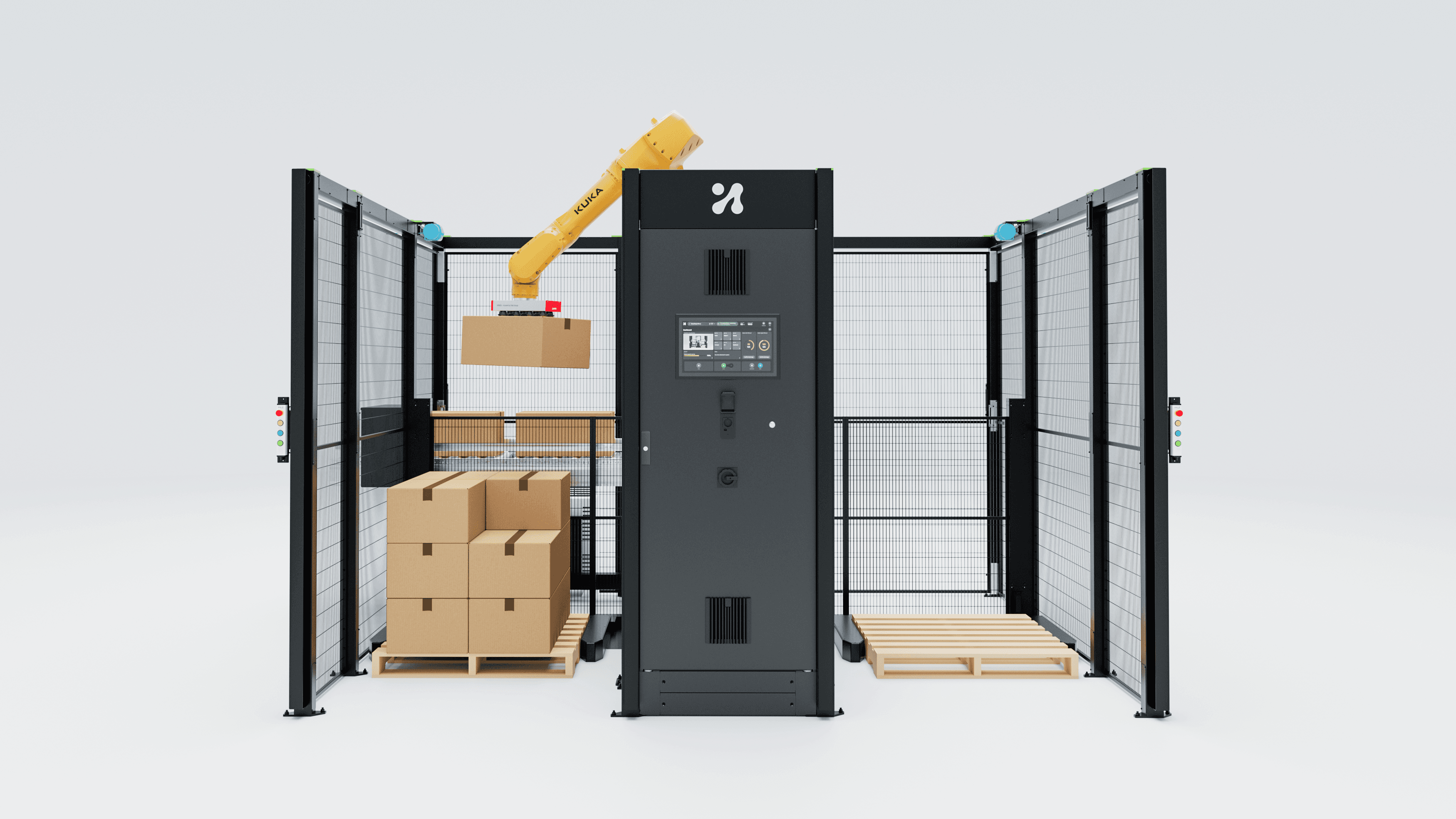
For forty years, the industrial HMI represented machine state. AI broke that contract. The screen's job is now accountability, and that is a different design discipline.
Push the button, watch the light.
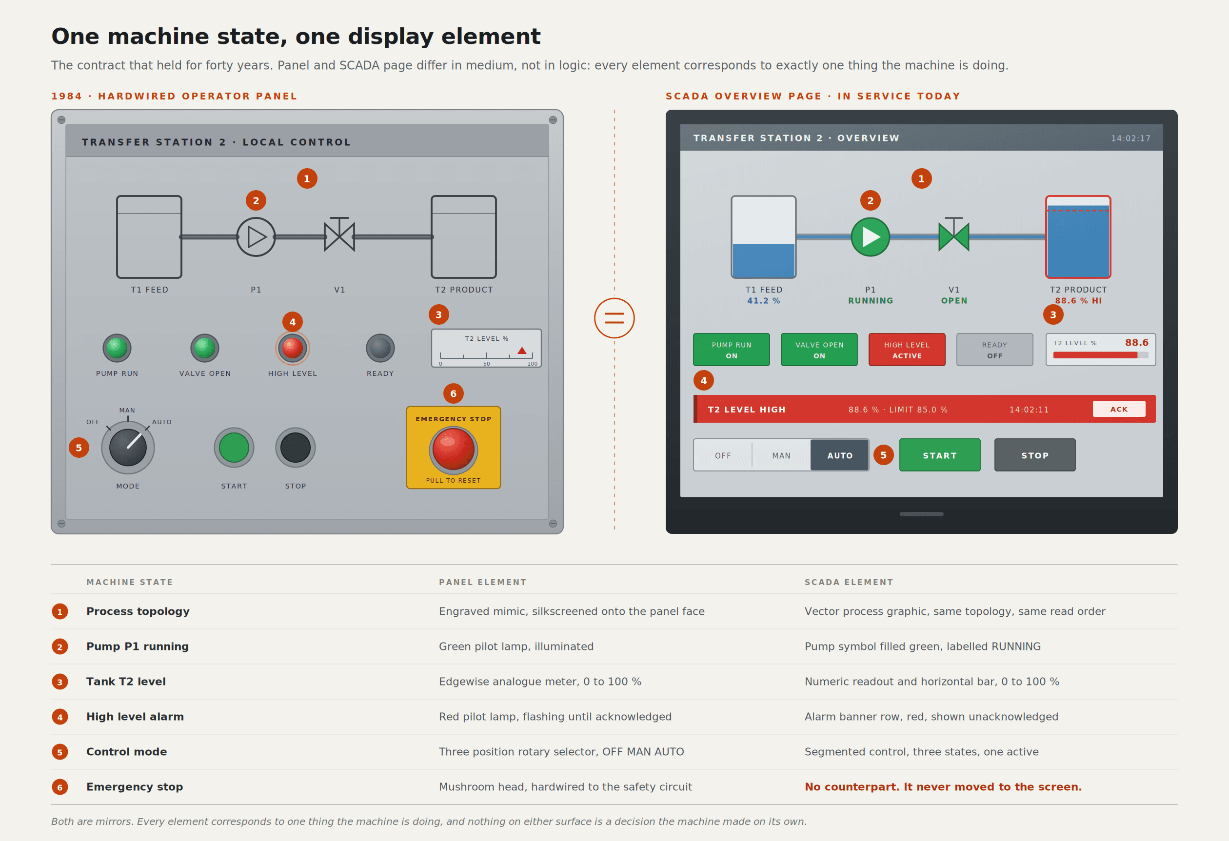
The first interfaces I ever saw in a factory were not screens. They were panels. A green mushroom head to start, a red one to stop, a row of pilot lights behind polycarbonate, a mimic diagram silk-screened onto the steel so you could see the line's flow without reading a word. Somewhere on the right, an alarm banner with an acknowledge button and a horn you could hear over the compressor.
That design was excellent. It was excellent because it kept a promise. You pushed the button, something happened, and an indicator confirmed it. If the indicator lied, the panel was broken, and everybody on the floor knew what a broken panel looked like.
SCADA inherited the same promise and put it on a CRT. The mimic diagram became a graphic page, the pilot lights became animated symbols bound to tags, the alarm banner became a scrolling list with priorities and timestamps. Underneath it all, the contract was identical: the screen is a faithful representation of machine state, and the operator's input changes that state directly.
You can build forty years of practice on a contract that clean. We did. Display hierarchies, alarm rationalisation, colour discipline, shift handover procedures- all of it rests on the same foundation. The machine knows what it is doing. The screen shows you. You decide.
ISA-101 is the best thing we have, and it was written for a different machine
If you want to see that contract expressed properly, read ISA-101.01-2015, "Human Machine Interfaces for Process Automation Systems" (ISA). It is the high-water mark of the representational era, and I have no criticism of it as a piece of work.
The standard gives you a lifecycle rather than a style guide: design, implementation, operation, continuous improvement. It asks you to write an HMI philosophy document before you draw a single page, so that the decisions about colour, layout, naming and navigation are made once, deliberately, and then applied consistently by everyone who touches the system afterwards. Two technical reports carry it further. TR101.01-2022 covers the philosophy itself and TR101.02-2019 covers usability and performance, including how to audit and validate an interface rather than admire it.
The high-performance HMI thinking that grew up alongside the standard was right too, and remains right. Grey backgrounds instead of black. Process values as shapes and trends rather than as numbers you have to compare in your head. Colour held in reserve so that when something goes red it means something, instead of competing with a decorative red pipe. A hierarchy of displays, so an operator can move from a plant-level overview down to a single loop without losing orientation.
I still apply all of it. On the operator screens, I design the background as a neutral dark surface; saturated colour appears only for abnormal and safety states, and the numerals are large enough to read at arm's length through safety glasses. None of that is my invention, and none of it is negotiable.
Here is what the standard does not cover, and honestly could not have. It assumes the plant's behaviour is known. Every display element in ISA-101 thinking maps to something an engineer specified: a valve is open or closed, a temperature is inside or outside a band, a motor is running or faulted. The discipline is to represent known states legibly and prioritise them sensibly. It has nothing to say about a screen that has to explain a probabilistic choice, because in 2015 no process HMI had to make one.
Three things that actually changed in the cell
I want to be careful here, because the version of this story that circulates in trade press is "AI took over the factory" and that is not what happened. What happened is narrower and more awkward.
The cell varies its own behaviour. In mixed-case palletising, the pattern is no longer a fixed recipe. Photoneo's 3D vision work on mixed palletising describes throughput of 300 to 1,000 cases per hour, a demonstration handling roughly 500 cases across about 20 SKUs, and stacks built up to six feet high, with AI-driven cycle-time optimisation dynamically determining pallet patterns and load balancing (Photoneo). Dynamically means the stack you get on Tuesday is not the stack you got on Monday, even with the same case mix. There is no page in the old paradigm for "the layout you are looking at was computed forty seconds ago and will not repeat". I wrote about this at length in AI in palletising.
Configuration moved from the integrator to the operator. This shift gets the least attention and causes the most trouble. The MalocherBot cells we build at Unchained Robotics are meant to be deployable in under a day with no coding (Unchained Robotics). That promise only holds if a person on the floor, not a commissioning engineer on a six-week contract, can change what the cell does. The moment you hand configuration authority to someone without a robotics background, every configuration screen becomes a safety-relevant interface.
The number of things the machine can be uncertain about went up by an order of magnitude. A proximity sensor is certain. A vision model that has decided the object in the bin is a transparent accessory bag is not. The Siemens Erlangen factory-floor study of a vision-language-action policy is the most honest published account of this I have read: they adapted a pretrained model, ran 900 episodes in a mock lab and 2,535 episodes on the factory floor over about ten hours, and still fell short of expectations, with failure modes including bag contents remaining on the product in 65% of cases and multiple bags grasped in 23% (arXiv). One conclusion is that camera placement and hardware ergonomics substantially limit what a policy can perceive and learn.
Read that last sentence as an interface problem, and it gets interesting. The policy's perception is constrained by physical decisions nobody on the floor can see. If the screen does not surface that, the operator is troubleshooting a behaviour whose cause is structurally invisible to them.
The out-of-the-loop problem is a design decision, not an accident.
A body of human factors research predicts exactly what happens next, and it predates the current wave of automation by thirty years.
Mica Endsley and Esin Kiris published "The Out-of-the-Loop Performance Problem and Level of Control in Automation" in Human Factors in 1995 (Sage). The finding is counterintuitive and has held up: as you increase the degree of automation, the operator's awareness of the system degrades, so when they finally have to intervene, they perform worse than if they had controlled the thing manually the entire time. Automation doesn't just remove work. It removes the continuous stream of small observations that made the operator competent to take over.
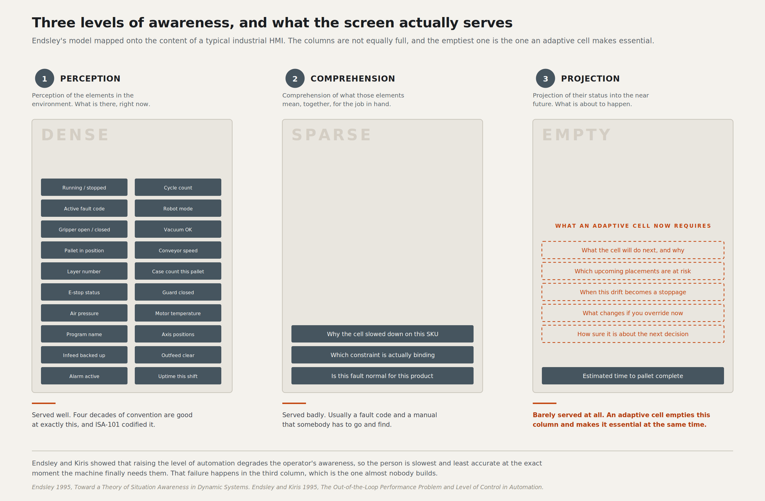
Endsley's model of situation awareness, from the same year, gives you three levels (Sage). Level 1 is perception of the elements in the environment. Level 2 is comprehension of what they mean. Level 3 is projection of what they will do next. She returned to the theme in 2024 in "Understanding Automation Failure", which is worth reading if you are about to argue that more autonomy will solve your reliability problem (Journal of Cognitive Engineering and Decision Making).
Now put a standard robot cell HMI next to that model. Running. Stopped. Cycle count. Current program. Fault code. That interface serves Level 1 competently and Level 2 barely. It serves Level 3 not at all.
An HMI that shows only running or stopped does not merely fail to prevent the out-of-the-loop problem. It manufactures it.
Level 3 is the level AI makes both harder and more necessary. Harder, because projection requires a mental model of the system, and a system that changes its own behaviour invalidates the operator's model faster than they can rebuild it. More necessary, because the intervention moments are now less frequent, more surprising, and more consequential. The operator who has watched a fixed-pattern palletiser for six months can tell you what it will do next without looking. The operator watching an adaptive one cannot, unless the screen tells them.
This is the single biggest change in the brief. The interface has to project. Not "the robot is at position 4". Something closer to "the next three placements go to the rear-left quadrant, the current pallet will close in about ninety seconds, and case 14 was flagged for re-scan".
Transparency is not a volume knob.
The obvious response to all of this is to show more. Put the confidence scores on the screen. Show the bounding boxes. Expose the model's reasoning. I have built versions of that, and I now think the naive form of it is a mistake.
The research is less flattering to the "just explain everything" position than people assume. Patterns' work on how transparency modulates trust in artificial intelligence is careful to note that the relationship is neither linear nor monotonic (Patterns). Endsley's own paper on supporting human-AI teams makes the same point from the situation-awareness side: transparency and explainability are means to appropriate situation awareness, not ends you can dial up indefinitely (Computers in Human Behaviour).
Two failure modes matter on a factory floor, and they are symmetrical. Under-trust means the operator constantly overrides a correct system; throughput collapses, and within a month somebody disables the feature. Over-trust means the operator stops checking, and the first time the system is confidently wrong, nobody is left in the loop to catch it. The second is more expensive, because it is silent until it is not.
A bare percentage feeds both failures. "Confidence: 87%" tells an operator nothing they can act on. Eighty-seven per cent of what, against what baseline, and is 87 good on this SKU? Nobody on a night shift reasons about calibrated probability while wearing gloves.
What works, in my experience on the cells I have designed for, is expressing uncertainty in the units of the operator's job. Not "87% confidence" but "this case is not in the catalogue; I have matched it to the nearest one by size". Not a probability distribution over grasp poses but "the surface is reflective, I have two grip options, and I am taking the slower one". The operator doesn't need the model's internal state. They need to know which of their own skills is now required.
Three interfaces, three kinds of authority
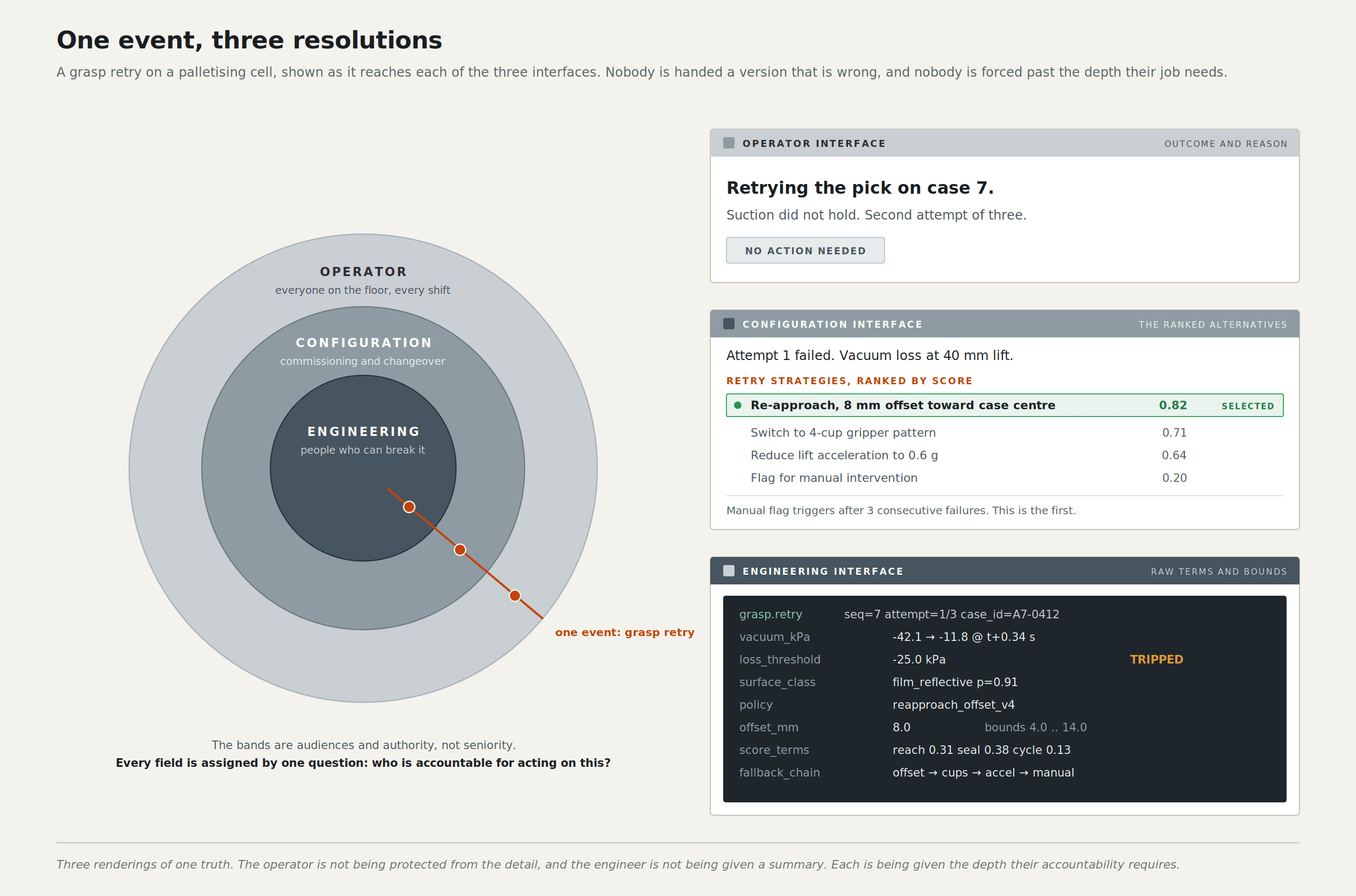
The structural answer we arrived at is to stop building one HMI. The stack I work on has three software interfaces, and they are split by role and decision authority, not by feature.
The engineering interface is the back end. This is where the system is built and where the deepest truth lives: the actual parameters, the models, the full logs, the things that will break the cell if you get them wrong. Its audience is people who are paid to understand robot kinematics.
The configuration interface is where you define and change a cell: what the gripper is, what the product is, what the pattern rules are, and where the safety boundaries sit. Its audience is a technically confident person on site who is not a robotics engineer and should not have to become one.
The operator interface is the one on the floor. Running the cell, changing over, clearing a fault, understanding what just happened. Its audience is the person standing in front of the machine at 05:40 on a Tuesday with a production target and no manual.
The split by feature would have been easier. Put everything in one application and hide the advanced parts behind a permission level. Plenty of vendors do exactly that, and it produces interfaces where the operator screen is visibly the engineering screen with things greyed out, which correctly tells the operator that they are being managed rather than informed.
Splitting by decision authority forces a harder and more useful question for every piece of information: who is accountable for acting on this? If the answer is the engineer, it belongs in the engineering interface and putting it on the operator screen is noise. If the answer is the operator, it belongs on the operator screen, and it has to be complete enough to act on without escalation. The same underlying truth appears in all three, at three different resolutions, and the resolutions are chosen by responsibility rather than by seniority.
That principle is what makes accountability designable. When the cell makes a decision, three legitimate questions arise. Why did it do that (operator interface)? Why is it configured to do that (configuration interface)? Why does the system behave that way at all (engineering interface)? One screen cannot answer all three without becoming useless to everyone.
The writing discipline is where this gets real. I wrote the operator-facing copy in blocks of roughly 350 characters per section. That is about two short paragraphs, and it does not survive hedging, a preamble, or a sentence explaining what the feature is called. You are forced to decide what actually matters and write only that. Every time I couldn't fit something into 350 characters, the problem turned out to be that I didn't yet understand the decision well enough to state it. I treat that now as a diagnostic rather than a constraint.
The physical context sets the rest. Gloves, so touch targets are generous, and nothing depends on a precise drag. Glare and variable light, so contrast is tested on the floor and not on a calibrated monitor in an office. Noise, so nothing important is audio-only. Shift handover, so the interface has to answer "what happened while I was not here" without anybody writing it in a book. And the assumption, always, that the person in front of the screen has not read a manual and never will. I have gone into the heuristics side of this in more detail in making automation heuristics legible in the HMI.
If you cannot validate it, you cannot ship it.
There is a hard constraint under all of this that designers outside the industry tend to discover late.
ISO 10218-1:2025 and ISO 10218-2:2025 were published in March 2025 after nearly eight years of work involving experts from over 20 countries (A3, ISO). The revision matters for interface design in ways that are easy to miss. The content of ISO/TS 15066:2016 has been folded into the two parts, so the technical specification no longer stands alone as the collaborative reference. "Collaborative robot" and "collaborative operation" have been replaced by "collaborative application", on the reasoning that only the actual application can be validated as collaborative, not the machine on its own. "Safety-rated monitored stop" has become "monitored standstill". Part 2 shifts emphasis from the robot system to the robot application, including workpieces, task programs and supporting machinery. Cybersecurity requirements are now in scope, and functional safety requirements are now explicit rather than implied.
The terminology change is the important one. If only an application can be validated, and the interface is part of how the application is operated and configured, then the interface is inside the validation boundary. It is not decoration applied to a safe machine afterwards.
I take a strong position on this: a screen that lets an operator change a parameter with safety consequences, without making the consequence visible at the moment of the change, is a defect in the safety argument even if every hardware interlock is perfect. The wording of a confirmation dialogue is a safety artefact. So is the decision about what to show by default versus burying it two taps deep.
The IFR's 2026 trends make the same point from the commercial end. Safety and security is one of the five, with explicit reference to alignment with ISO standards and liability frameworks, and to the cybersecurity risk introduced by cloud-connected AI (IFR). Liability is the word to watch. When a cell makes an adaptive decision, and something goes wrong, the question in the room afterwards is what the system showed the operator and what the operator could reasonably have understood. That is an interface record.
Six things I actually design by
These are positions, not best practice. I hold them because they have survived contact with real cells.
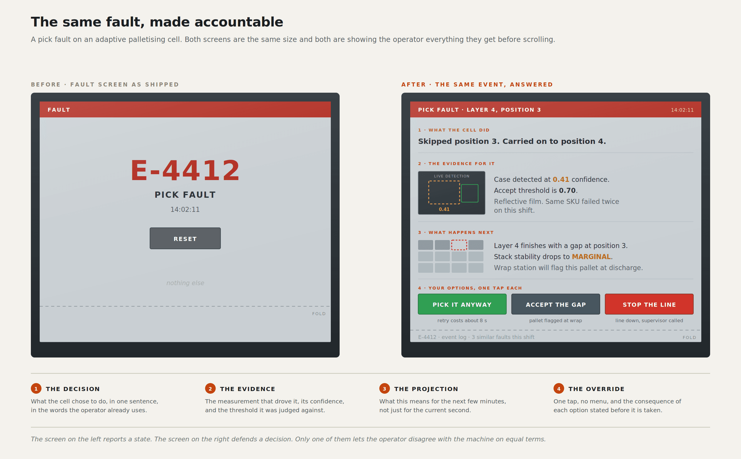
Never show a decision without its evidence. If the screen says the system chose a slower grip, the reason belongs in the same visual block, not in a log. Evidence isn't a model dump. It means the one input that drove the choice, in plain language. An operator who sees a decision with no cause learns to treat the machine as arbitrary, and once they believe it is arbitrary, they stop reading the screen entirely.
Make the override cheaper than the workaround. Every cell I have worked on has an informal workaround culture: the pallet gets restacked by hand, the sensor gets taped over, the job gets run in a mode nobody documented. That happens when overriding the system properly is slower than going around it. If your override takes four taps and a password, you haven't prevented overrides; you have made them invisible. Put the override one tap from the decision it corrects, log it, and let people tell you the truth about how the cell actually runs.
State uncertainty in the units of the operator's job. Covered above, and it is the rule I argue about most. Seconds, cases, millimetres, "this one is unfamiliar", "this one is reflective". Never a bare probability.
Design the failure state first. I now draw the fault screen before the running screen. The running screen is easy, and everybody enjoys designing it. The fault screen is where the interface earns its money, and if you design it last, you will discover you have nowhere to put the information the operator needs because the layout was optimised for the happy path. Start with the worst three minutes of the shift and work backwards.
A changeover is a design problem, not a training problem. The standard industry answer to a confusing changeover is more training. I think that is an admission of design failure dressed as an investment in people. If a product changeover requires someone to remember a sequence, the sequence belongs on the screen. On an adaptive cell, this matters more than it used to, because the operator cannot rely on the machine behaving the way it did during the last changeover.
The interface has to say what it does not know. This is the newest of the six, and the one vendors resist hardest, because admitting uncertainty feels like admitting weakness in a sales demo. A system that never says "I am not sure about this one" trains operators into exactly the over-trust the research warns about. Silence reads as confidence, and a silent system that is wrong is the worst artefact we can ship.
We are still hiring people to draw panels.
Watch how HMI work is scoped in this industry, and you can see the lag. The brief is still visual: make the screens look modern, apply the brand, align the grid, choose an icon set. The deliverable is a Figma file full of pages that correspond to machine states. That was the correct deliverable when the machine had a knowable number of states, and the screen's job was to mirror them.
Now the job is to design an argument. The cell concluded. The interface has to present that conclusion, the evidence behind it, the confidence in it expressed in something a person can use, the projection of what follows, and a cheap, honest way to disagree. That is closer to building a case than drawing a panel, and it requires skills not in the job description: information hierarchy under uncertainty, plain-language writing under severe constraint, and a willingness to say on screen that the system does not know.
I do not think the tooling is the bottleneck. The AI platforms for producing and prototyping these interfaces are improving fast, and I have written separately about what they are actually good for. You can generate a plausible screen in an afternoon now. Generating a plausible screen was never the hard part.
The bottleneck is that most vendors have not noticed the contract changed. They are shipping adaptive cells behind representational interfaces, which means they are shipping systems whose behaviour their own users cannot predict, with a screen that quietly implies everything is fine because the light is green. Growth won't slow down enough for anyone to catch up on this. The IFR counted 542,000 industrial robot installations in 2024 and 4,664,000 units in operational stock, up 9% on the year, with over 700,000 annual installations forecast by 2028 (IFR).
Every one of those installations gets a screen. Most of them will get a mirror.
Sources
Global robot demand in factories doubles over 10 years, International Federation of Robotics.
Top 5 Global Robotics Trends 2026, International Federation of Robotics
Updated ISO 10218 FAQ, Association for Advancing Automation (A3)
ISO 10218-2:2025, International Organisation for Standardisation
Endsley, Toward a Theory of Situation Awareness in Dynamic Systems, Human Factors (1995)
How transparency modulates trust in artificial intelligence, Patterns
Deploying a vision-language-action model on the factory floor, arXiv
Leon Potgieter designs HMI and visual systems for industrial robotics. He has spent the last five years as the visual systems designer for Unchained Robotics in Germany, working on the operator, configuration and engineering interfaces behind the MalocherBot cell.