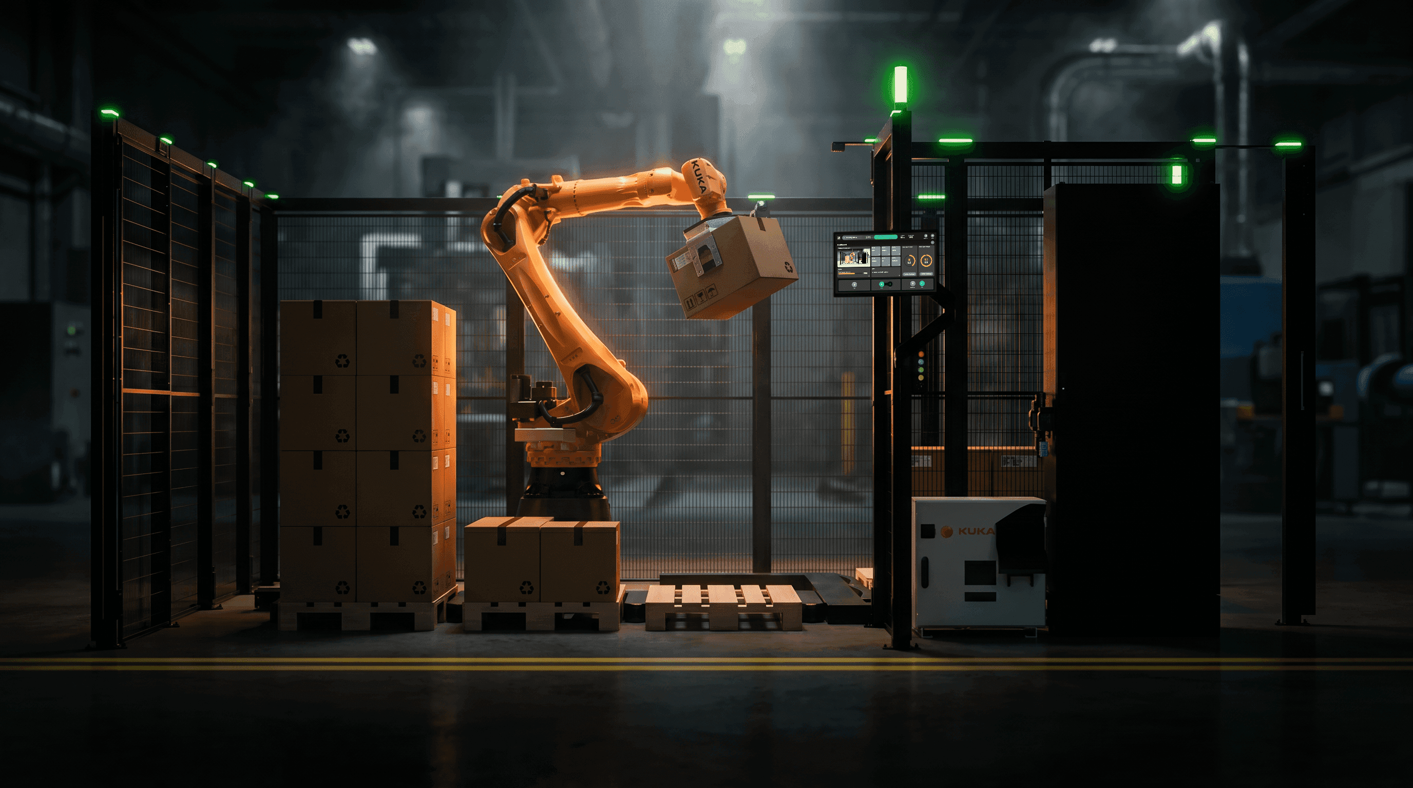
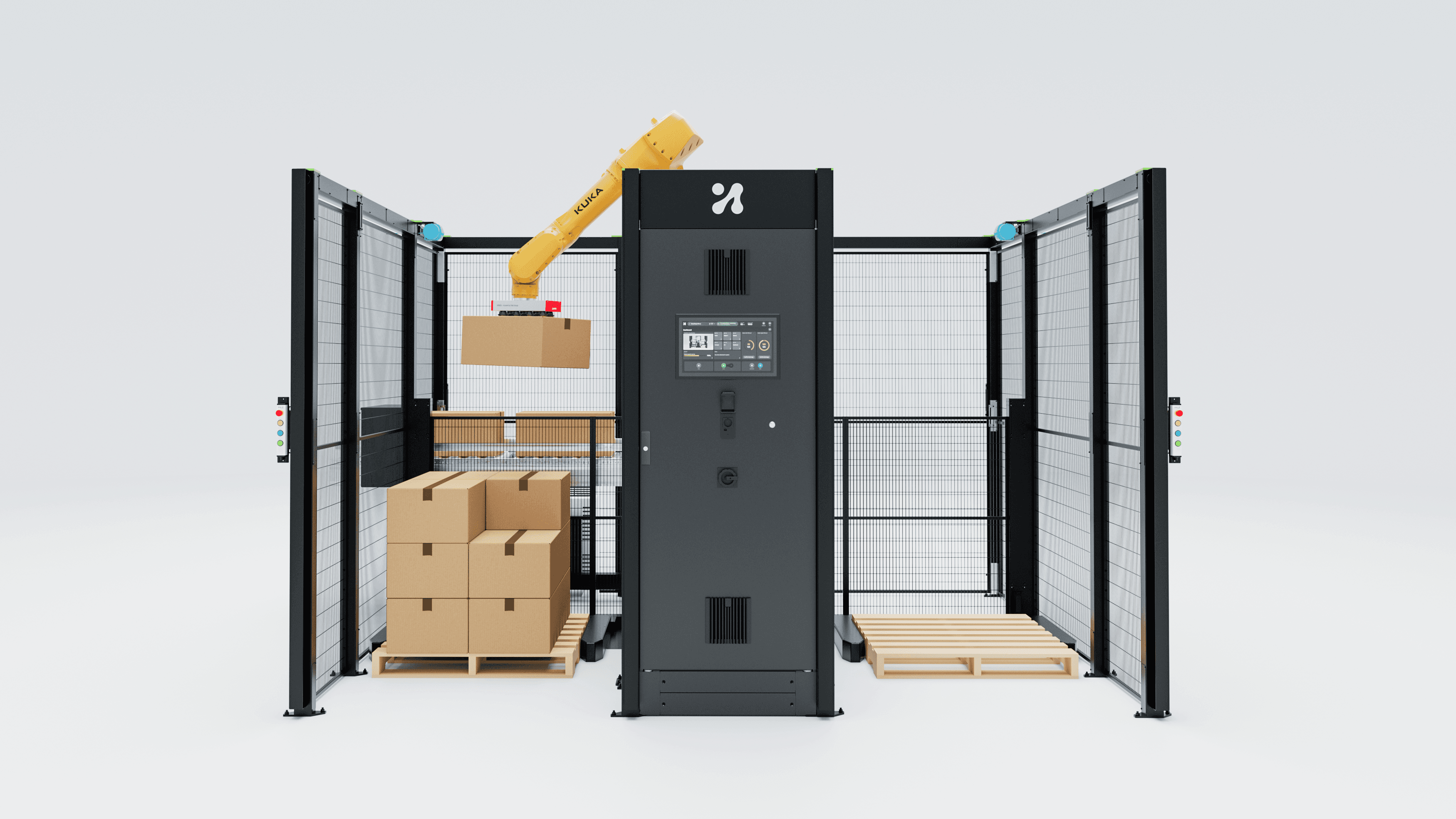
Automation heuristics are not hard to understand, they are invisible. A working method for exposing a machine's ranked decisions at the right depth in the HMI.
The box it did not pick
A cell is running a mixed pallet. Cases come off the infeed in whatever order the upstream line produces them, which is to say not the order anyone planned. The robot reaches past a case sitting right there, in easy range, and takes the one behind it instead. The operator sees this. She has watched this cell for four months, and she thinks: that was the wrong box.
She looks at the screen. The screen says PICKING. There is a small render of the pallet, a case count, a cycle time, a green bar. Everything is nominal. No button, no gesture, no long press answers the only question she has, which is why that box and not this one.
So she builds an explanation herself. Maybe it prefers the back row. Maybe it does not like the shiny cases. Maybe it gets confused when the conveyor is more than half full. None of these are true, but all of them are now load-bearing beliefs in how she runs the line, and one of them will eventually turn into an intervention. She will pre-sort the infeed to "help" it. She will lower the fill level. Six months later somebody will be trying to work out why this cell runs below its sister cell, and the answer will be a folk theory that a screen allowed to form because it had nothing to say.
That is the actual cost of an opaque heuristic. Not confusion in the moment. Superstition as a long-term operating procedure.
Nielsen wrote for software that does what it is told
Jakob Nielsen's ten usability heuristics have held up since 1994 with almost no revision, which is remarkable and also the problem (Nielsen Norman Group). They were written for deterministic software: software that does what you ask, in the order you ask it, where every outcome traces back to something a person did. Industrial HMI inherited them wholesale, and for a PLC-driven machine with a fixed sequence that was fine.
A cell that decides is a different object, and five of the ten break hard against it.
Visibility of system status was written to describe a state, not a choice. "Running", "Homing", "Waiting for pallet" are states. When a solver has just ranked eleven candidate picks and taken the top one, the status is not the interesting part of the system. Status visibility answers "what is it doing", and the operator above needed "what did it consider". Almost every industrial screen I have opened answers only the first.
Match between the system and the real world turns into something much harder. It stops being about vocabulary (call it a pallet, not a "target surface entity") and becomes a question about the scoring function. The operator has a mental model of what a good job looks like: tight stacks, fast, no crushed cases, SKUs for the same store kept together. If the machine's weights and that model disagree, the interface has to make the disagreement visible, because a mismatch nobody can see reads as a malfunction.
User control and freedom was an undo button. On a cell that decides it becomes a colder thing: the right to override, and the honest cost of doing it. An operator who forces a pick order can break the stability scoring for the rest of that layer. Nielsen's version says give people an emergency exit. Mine says show the price on the exit sign before they take it.
Recognition rather than recall is the one that matters most and the one nobody implements. What the operator is being asked to hold in her head is the set of options the machine rejected, which she cannot possibly know. Show the runners-up.
Help users recognise, diagnose and recover from errors carries a failure mode Nielsen never had to handle: the confident wrong answer. A classical machine fault throws a code. A heuristic that picks a bad pattern, or a learned policy that grasps a bag at the wrong point, throws nothing. It completes, and it reports success. The Siemens team fine-tuning a vision-language-action model on their Erlangen factory floor logged exactly this shape of failure, including bag contents left sitting on the product in 65% of one trial's failures and bags not fully inserted in 15% (arXiv). None of those are error states in the traditional sense. The machine did a thing, the thing was wrong, and nothing lit up.
New error class, new interface response: not an alarm, but a visible margin of doubt attached to the normal running screen.
Name the heuristics or nobody can see them
Talking about "the algorithm" guarantees the conversation stays vague. On a palletising cell the machine-side heuristics are specific, separable, and each is a ranked choice with runners-up.
Pattern selection. Interlocked bond versus column stack. Interlock buys stability through friction and overlap, column stacking buys compressive strength straight down through the corners, which is where a corrugated case is strong. The solver picks one per layer, sometimes per SKU group. It had a second choice.
Crush strength and stacking order. Heavy at the bottom is the rule of thumb everyone knows. The real heuristic is a per-SKU load rating against cumulative mass above, which is why a light case sometimes gets placed early and a heavy one waits.
Centre-of-gravity and stability scoring. A continuous score, not a pass/fail. The pallet has an evolving CoG and the solver keeps it inside a footprint while also filling volume. Those two goals fight, constantly.
Pick sequencing when cases arrive out of order. This is the one that produced the moment at the top of this article. Out-of-sequence arrival is a known headline failure driver for 2D vision, alongside glossy, reflective or dark packaging (Photoneo). A 3D-vision mixed palletising setup running 300 to 1,000 cases per hour re-plans constantly, and reaching past the near case is very often correct.
Reachability and singularity avoidance. A pick that is geometrically valid can still be a bad idea because the arm would pass close to a wrist singularity or need a reorientation costing 900 milliseconds. The solver knows. The screen does not say.
Gripper selection and vacuum zone activation. On a multi-zone vacuum end effector, which zones to fire is a heuristic about case footprint, surface porosity and expected mass. Fewer zones is faster and cheaper on air, and sometimes drops the box.
Speed and separation monitoring. Under ISO 10218-1:2025 and ISO 10218-2:2025 this is a validated property of the application rather than the robot, which is why the 2025 revision moved the language to "collaborative application" and folded in what used to be ISO/TS 15066 (Automate). When the cell slows because a person crossed a boundary, the operator experiences an unexplained slowdown and the cell experiences a correct safety response.
Seven heuristics, all running at once, all ranked, all invisible. I wrote about how these stack up on the machine side in AI in palletising. This piece is about the other half of the problem.
The rejected alternatives are the most informative thing you can put on an operator's screen, and they are almost never on it.
Progressive disclosure is the whole discipline
Here is the method I keep coming back to, and the thing I have spent most of five years building into a three-interface stack. One decision, four depths. Each depth is a complete answer for somebody. Nobody is forced past the depth they need.
Depth 1: the outcome. "Placing case 34 at position C3." One line, always visible, no interaction. This is what the running screen owes you. It is table stakes and most systems get it right.
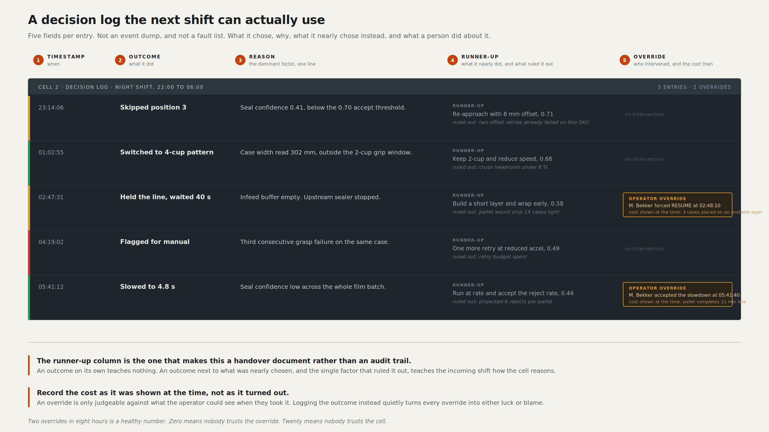
Depth 2: the reason, in one line. "Placed at C3 to keep the layer's centre of gravity inside the pallet footprint." Still no interaction beyond glancing. This is the depth that would have saved the operator in the opening scene, and the depth that is missing almost everywhere. It costs you one line of text and a rule that the line must name the deciding factor, not the category of factor. "Stability" is useless. "Centre of gravity drifting left" is an explanation.
The discipline at depth 2 is brutal compression. On the interface copy I work to a budget of roughly 350 characters per section, and reason strings run far tighter than that. The constraint is not something to work around, it is what forces the writing to be true. You cannot hedge in forty characters. You have to name one factor and commit, which means the software has to know which factor dominated, which means somebody on the engineering side has to expose the top term of the score rather than the score. Half the design work here is arguing for that field to exist in the API.
Depth 3: the ranked alternatives and the deciding factor. Tap the reason, get the shortlist. Three to five candidates, in rank order, each with its score and, critically, the one term that separated it from the winner. "C3 (0.91). D1 (0.88), rejected: crush rating on case below. A4 (0.71), rejected: reach margin 12mm."
This depth repairs a mental model instead of patching it. An operator who sees the runners-up twenty times learns the shape of the scoring function without anyone writing a training module. She stops having folk theories because she has evidence. She also becomes the best bug detector you will ever have, because when the ranking is wrong she can see that, and she can tell you which term is wrong.
Depth 4: the raw parameters and the weights. Objective function terms, their coefficients, the constraint set, and the ability to change them and re-run. Not for the operator, and pretending otherwise is how you get a cell configured by somebody who should not have been configuring it.
The mapping onto three interfaces is clean, and it was not an accident. The operator-facing interface carries depths 1 and 2 and reveals depth 3 only on explicit request, because its job is a person standing at a machine with a queue building behind them. The cell configuration interface lives at depth 3: whoever is commissioning or tuning needs the ranking as the primary object, because their job is to make it produce the behaviour the customer wants. The back-end engineering interface owns depth 4. Weights, constraints, solver parameters, and the freedom to break things.
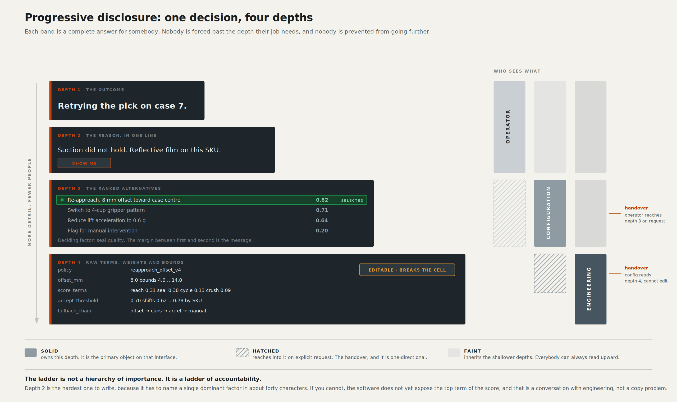
The principle underneath all four: every depth must be a complete, honest answer at that depth. Not a teaser, not a truncation. If depth 2 is a summary that misrepresents depth 3, the ladder is worse than showing nothing, because you have taught the operator to distrust the explanation as well as the machine. Progressive disclosure fails the moment a layer lies to make itself shorter.
One more rule I hold to: going deeper must never be modal, never require a login, and never leave the running screen. The instant an operator has to exit the process view to ask why, they will not ask.
Aim at situation awareness, not at clarity
"Make it clearer" is not a target you can test. Situation awareness is.
Mica Endsley's model has three levels: perception of the elements in the environment, comprehension of what they mean, and projection of what will happen next (Endsley 1995). Hold industrial HMI against those three and the pattern is embarrassingly consistent. Level 1 is served well, because we are excellent at showing values, states, counts and positions. Level 2 is served badly: we show that the fill rate is 78% but not whether 78% is good for this pallet at this point in the build. Level 3 is barely attempted, and almost nothing on a standard screen helps an operator predict the machine's next several moves.
Projection is exactly what you need when a learned policy is running, and it is the level automation itself erodes. Endsley and Kiris named the out-of-the-loop performance problem three decades ago: as automation takes over, operator awareness degrades, so when they finally must intervene they perform worse than if they had been controlling the process manually all along (Endsley & Kiris 1995). Endsley returned to it in 2024 with a broader treatment of how automation failures unfold for the people who have to catch them (Endsley 2024).
The practical move is to put the next few decisions on screen, not just the current one. Show the planned placement for the next two cases with the same reason line, greyed. Cheap, honest about being a plan rather than a commitment, and it converts a screen that reports the past into one that supports projection. When the machine deviates from its own displayed plan, the deviation is itself information.
Confidence, without lying about it
Nearly every attempt I see to surface machine uncertainty reaches for a percentage. "Grasp confidence: 87%." I am against it, and I will defend that.
That number is usually a softmax output or a solver score never calibrated against real-world success rates, which means 87% does not mean "succeeds 87 times in 100". Putting it on a screen in a font that looks like a measurement makes a claim the system cannot back, and operators calibrate to it fast and wrongly. You have manufactured over-trust, which the human-AI teaming literature treats as a genuine failure mode (Endsley, Computers in Human Behavior).
Three patterns I would use instead.
Thresholded language tied to an action. Three or four bands, each bound to what the operator should do. "Routine." "Unusual, watch this pick." "Low margin, verify before the next layer." The band is the interface, the number stays in the log. Bands are honest about being coarse, which is appropriate, because the underlying estimate is coarse.
Margin between first and second choice. More useful than absolute confidence and much harder to misread. If the top pick scored 0.91 and the runner-up 0.88, the machine is close to indifferent and a small perturbation will flip it. If the gap is 0.91 to 0.34, the decision is robust. The gap tells an operator how stable the behaviour is, which is what they need in order to decide whether to watch or walk away, and it falls out of depth 3 for free.
What would change the answer. "If the case below were rated for 5kg more, this would go to D1." Counterfactuals give someone a working model of a decision boundary faster than anything else I have tried, and they are specific enough to act on.
Research on transparency does not support "more explanation is always better", and I do not want to overclaim in the other direction either. The relationship between how much a system explains and how appropriately people trust it is not linear, and explanation can push trust up when it should be going down (Patterns). Another argument for the ladder: the right amount of explanation is not a constant, so let the person choose the rung.
ISA-101 gave us the grammar
Credit where it is due. ISA-101.01-2015 and its technical reports, particularly ISA-TR101.01-2022 on HMI philosophy and ISA-TR101.02-2019 on usability and performance, are the best inheritance industrial interface design has (ISA). The lifecycle model (design, implementation, operation, continuous improvement) treats an HMI as something maintained rather than shipped. Requiring a written HMI philosophy document forces teams to decide what their screens mean before they draw them. The display hierarchy gives you a defensible answer to "which screen does this belong on".
And the high-performance convention of desaturating everything normal, greys and low-contrast line work, colour held in reserve for abnormal conditions, is exactly the right foundation for what I am arguing, for a reason that predates AI: if nothing is coloured, colour means something. That convention hands decision disclosure a free and precious channel. Colour becomes available to mean "this decision is not routine", and it will be seen across a factory floor.
What ISA-101 lacks is a vocabulary for decisions. Its display hierarchy organises by process area and level of detail, the correct decomposition for a plant where equipment does what it is told. There is no rung for "the same decision at four depths of explanation", and no guidance for output that is a ranked list rather than a value. The standard's own lifecycle gives us permission here, since continuous improvement is in the model. This is the improvement. I have written about how much established HMI practice survives the shift to systems that decide in HMI design after AI: more survives than people expect, but the gaps sit exactly at the decision boundary.
The constraints nobody designs for
Everything above has to survive contact with the room.
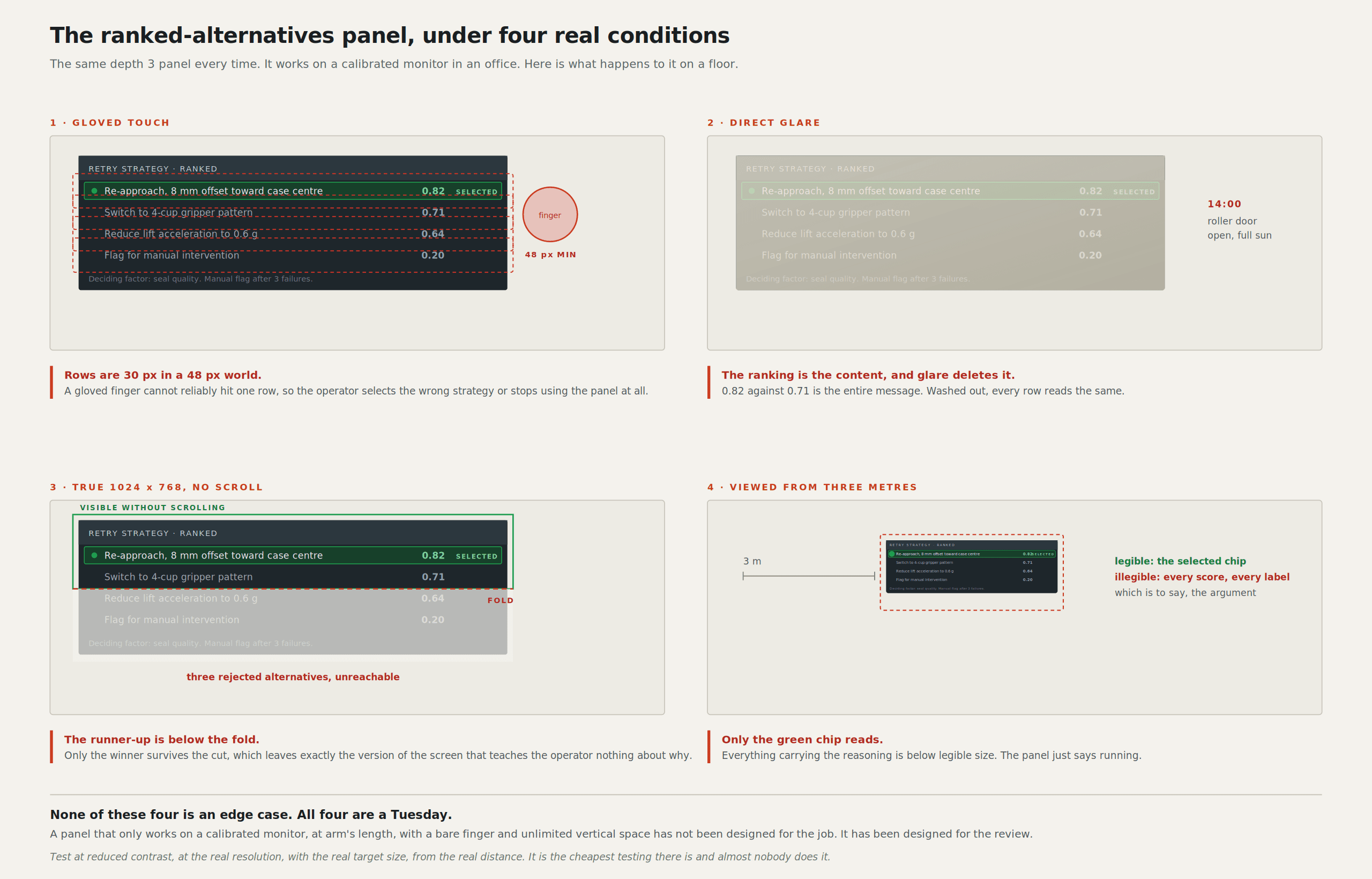
Gloves. Nitrile is fine, a cut-resistant glove on a capacitive panel is not. Minimum touch target goes up, and the elegant tap-to-expand interaction at depth 3 has to work with a finger that reports as a 25mm blob.
Glare. A panel under high-bay LEDs with a roller door forty metres away that opens onto full sun. Low-contrast greys that look sophisticated in Figma go invisible at 14:00. I check every screen at reduced contrast for this reason, and it is the most common thing I send back.
The panel itself. A 1024x768 unit that went in eight years ago and will not be replaced because it works. That is the real canvas more often than anyone admits, and a depth-3 alternatives list has to fit it without scrolling.
Shift handover. Whatever the machine decided at 05:40 has to be legible to somebody who arrived at 06:00. A decision log that records reason strings, not just events, turns handover from anecdote into evidence.
Ninety seconds is roughly what an operator has before the infeed backs up. Every depth transition has to be worth doing inside that window, which means depth 2 has to answer the question most of the time. If people routinely need depth 3 to understand a routine decision, depth 2 is written badly.
And the one that gets forgotten: the person reading the screen may never have been trained on the feature. A "why" affordance has to be discoverable by someone poking at a screen out of frustration, because that is the exact emotional state in which it will first be found.
Eight heuristics for machines that decide
If the system ranked something, say so, and name the deciding factor in one line of the operator's language, visible without interaction.
Show the runners-up on demand with the single term that rejected each, and never let a shallower layer contradict a deeper one.
Show the margin between first and second choice rather than an uncalibrated confidence percentage.
Give every override a visible price before it is taken, not an error message after.
Put the next two decisions on screen as a plan, so deviation from that plan becomes visible information.
Treat the confident wrong answer as an error class that needs an interface, because it will never raise an alarm.
Keep colour reserved, and spend it on "this decision is not routine" rather than on decoration.
Match the depth to the interface: operators get outcome and reason, configurers get the ranking, engineers get the weights.
I would rate the industry at about one and a half of those eight, and the ones we do reliably are inherited from ISA-101 rather than earned. The rest is open ground, and the tooling for building it has never been better, which I get into in AI platforms for building HMI visual interactions.
The operator at the top of this article was right to ask why. The failure was not hers and it was not the solver's. The solver had a perfectly good answer, ranked and scored and sitting in memory, and the screen did not carry it. That is a design decision somebody made, probably without noticing they were making it.
Sources
Jakob Nielsen's 10 Usability Heuristics for User Interface Design, Nielsen Norman Group
Toward a Theory of Situation Awareness in Dynamic Systems, Endsley 1995, Human Factors
Understanding Automation Failure, Endsley 2024, Journal of Cognitive Engineering and Decision Making
How transparency modulates trust in artificial intelligence, Patterns
ISA-101 Human Machine Interfaces for Process Automation Systems, International Society of Automation
Deploying a vision-language-action model on the factory floor, arXiv
Leon Potgieter designs HMI and visual systems for industrial robotics. He has spent the last five years as the visual systems designer for Unchained Robotics in Germany, working on the operator, configuration and engineering interfaces behind the MalocherBot cell.