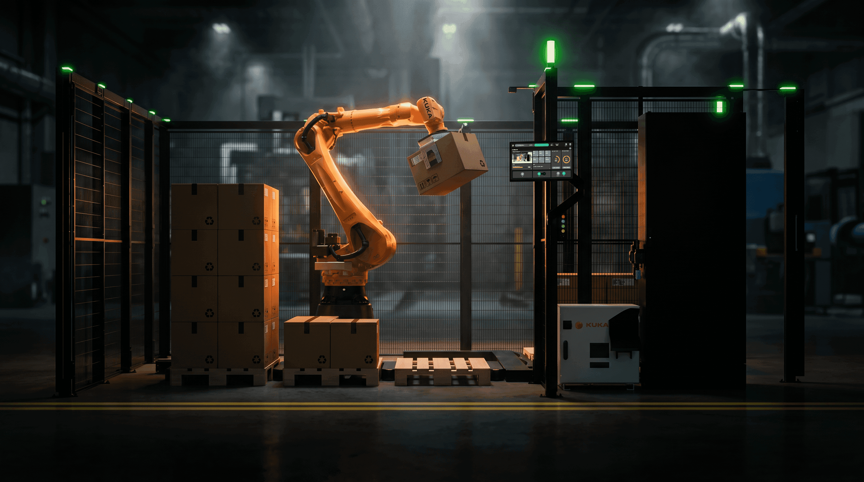
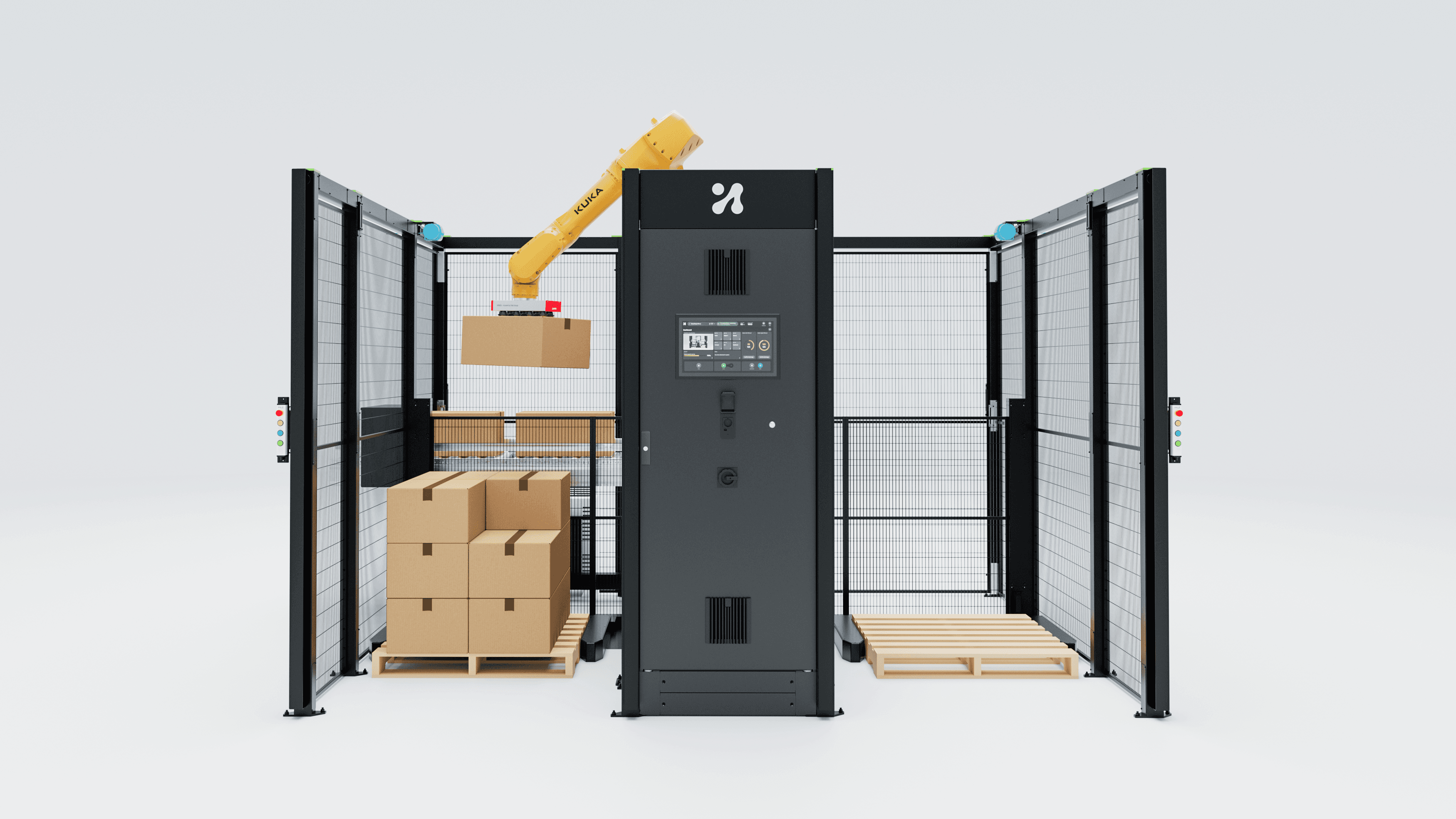
Slop isn't an aesthetic failure; it is output made without a cost function. What taste actually is, why perception is trainable, and where AI still loses.
The word of the year was a diagnosis.
In December 2025, Merriam-Webster chose "slop" as its word of the year, defining it as "digital content of low quality that is produced usually in quantity by means of artificial intelligence" (PBS NewsHour). The company's president listed what it covers: absurd videos, weird advertising images, cheesy propaganda, fake news that looks real, junky AI-written books (CNBC).
Every designer I know read that and felt quietly vindicated. See, the machines make rubbish. Our jobs are safe.
That is the comfortable reading, and it is the wrong one. The volume of bad work did not suddenly increase in 2025. Bad work has always been the overwhelming majority. What changed is the resolution at which we can tell bad from good.
Most work is now judged at a size where only surface quality is visible. A thumbnail in a feed. A slide at 40% zoom in a screen share. A screenshot pasted into a Slack thread by someone deciding whether to book a call. At that size, the only available signal is whether the thing looks like the category it belongs to, and looking like the category is exactly what generative systems do cheaply and reliably.
I have spent twenty-five years partly in the business of winning at that size. Digital campaigns for Samsung, Coca-Cola, Standard Bank, Old Mutual, DSV. A good part of that craft was making something read as considered in the first half-second. That specific ability is now available for the price of a subscription, and pretending otherwise is a bad career plan.
Slop is a decision failure, not an aesthetic one.
Here is the definition I actually use. Slop is output that has the surface features of a decision without a decision having been made. It is what you get when nothing was chosen against a constraint.
A cost function is what makes a choice cost something. In design, it is usually a person, a task, a budget, a physical environment, a regulation, a load time, a colour-blind operator, a gloved hand. If you can point at the constraint and say "I gave up X to get Y", you made a decision. If you cannot, you produced slop, regardless of how good it looks.
Three examples from work I either did myself badly or was handed to fix.
The dashboard with six chart types. A doughnut, two line charts, a stacked bar, a gauge and a heatmap, all on one screen, all beautifully aligned to an 8pt grid. Ask it a question, and it has no answer. Nobody asked what the operator needs to know in the first three seconds of a shift, so every chart is there because charts belong on dashboards.
A brand system with eleven gradients. It is genuinely attractive. It also has no hierarchy, because hierarchy is a statement about what matters more than what, and eleven gradients refuse to make that statement. The deck looks expensive. The first real application breaks it.
An HMI mockup that is unusable with gloves on. This one I care about most, because I see it constantly: beautiful screen, 32px touch targets, thin 300-weight type, low-contrast greys, a gesture-driven carousel. Then you stand a shift worker in front of it in a cold store wearing cut-resistant gloves under a fluorescent tube at 2 am and none of it works. Not one of those choices was made against the environment. Every one was made against a screenshot of another interface.
Notice that none of these requires AI. Humans have been producing slop at scale since the first template marketplace. Generative tools took the marginal cost of producing plausible surface to roughly zero, which has permanently changed the ratio of surface to decision in the world.
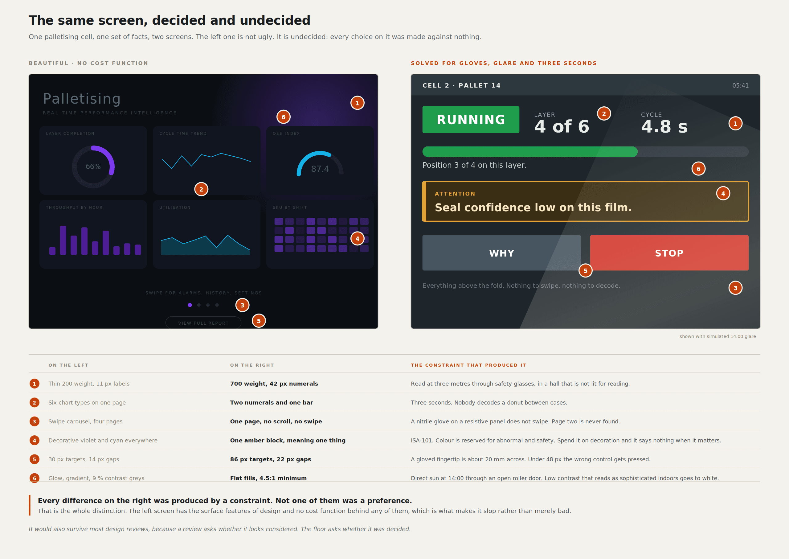
The practical test is not "does this look good". It is "what did this cost". Show me what you rejected and why. If there is no answer, there is no work in there, only output.
Taste is compressed judgment you have already paid for
A phrase is going around: AI made taste the differentiator. As usually stated, it is unfalsifiable flattery aimed at designers, and it is popular for that reason. Nobody defines taste, so everybody gets to believe they have it.
My definition: taste is compressed judgment, and the compression happened because you personally paid for the consequences. Knowing what looks good is not taste. Knowing what will fail, where it will fail, and to whom, is.
That distinction matters because the second kind of knowledge has a source. You were there when the thing broke. You watched a line supervisor stop using a screen you designed because it needed two hands. You watched a campaign visual test badly in a market you did not understand. You shipped a colour that was fine on your monitor and illegible on the cheap panel the integrator actually bought. Each of those events cost you something, and what remains afterwards is a fast, wordless sense of where the edges are. People mistake that speed for intuition.
Taste is not knowing what looks good. It is knowing what will fail, where, and to whom, because you were there when it failed.
Taste is also specific, which is the part almost nobody admits. Taste in typography does not transfer to taste in motion. Taste in motion does not transfer to taste in interaction. Taste in interaction absolutely does not transfer to taste in industrial safety.
I can rate my own honestly. Typography and layout: big, twenty-five years of paying for mistakes. Motion and 3D: high, because I animate the MalocherBot cell often enough to have been wrong about timing, camera and material hundreds of times. Industrial HMI: high, and hard-won, because shipping cell interfaces put me in rooms with people who would tell me flatly that a screen did not work. Sound design: zero. Typeface design: zero. I have preferences in both. Preferences are not taste.
Most claims of taste are claims of familiarity. You have seen a great deal of a particular thing, so unfamiliar work feels wrong to you and familiar work feels right. That is a real perceptual effect, and it is genuinely useful inside its own domain, but it collapses the moment the context changes. It is why an award-winning consumer app designer can produce a dangerous machine interface and never notice.
Perception is the half nobody trains.
Before you can have judgment about a difference, you have to be able to see the difference. Mica Endsley's model of situation awareness puts perception of the elements at level one, comprehension of their meaning at level two, and projection of future status at level three (Endsley, Human Factors, 1995). You cannot comprehend what you never perceived. Most design failures I have seen are level-one failures wearing level-two clothing.
The good news is that perception is trainable. It is not a personality trait, and it is not something you either have or do not. It is a discrimination skill, built the same way a wine taster, a radiologist, or a mechanic who diagnoses an engine by sound builds it: repeated exposure with feedback about causes.
This is where my other practice is actually relevant rather than decorative. I have been firing ceramics for the better part of twenty years, almost entirely in alternative processes: raku, pit, barrel, obvara, saggar, copper fuming. The defining feature of all of them is that you control the inputs completely and then surrender the outcome. You mix the slip, build the form, choose the copper carbonate, the salts, and the combustibles, set the packing, and decide the temperature at which the piece comes out. Then it goes into a reduction chamber or a fire, and the result is decided by variables you cannot fully instrument: how much oxygen got starved, how fast it cooled, where the wind was, what the sawdust did in the last forty seconds.
What twenty years of that trains is not preference. It trains one narrow skill, over and over: look at a finished surface and infer the cause. This crazing pattern means thermal shock at that rate. That red flashing to blue means the copper got a specific atmosphere at a specific moment. That dull patch means the piece was sealed from the smoke by its own neighbour in the barrel. You are reading an outcome backwards into the process that produced it, and the fire gives you unambiguous feedback several hundred times a year.
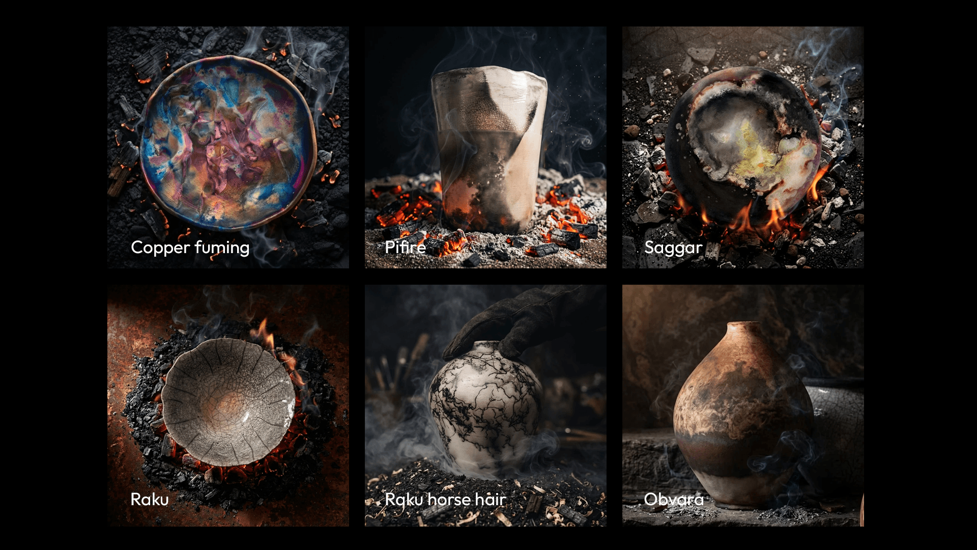
That skill is transferable, not aesthetic. Applied to an interface, it's the same operation: look at a screen and infer which decision produced it. This spacing came from a component library default, not from a reading distance. This colour came from a brand palette, not from a contrast requirement. This information architecture came from the database schema, not from the operator's task. These four states exist because someone drew the happy path and then drew failure as an afterthought.
Once you can read a screen that way, slop becomes loud. It stops being a vague feeling that something is off and becomes a specific claim: no decision was made here, and I can tell you exactly where it wasn't.
The uncomfortable economics
Now the part that the taste-will-save-us crowd skips.
AI is very good at the median. That is not a slur; it is a description of how the systems work: they are trained to produce the most probable continuation, and the most probable continuation of "design a SaaS landing page" is an extremely competent SaaS landing page. A very large share of professional design work was median work. Competent, on-brand, defensible, unremarkable, and priced as if competence were scarce.
Competence as a service is being repriced right now, and the repricing is not finished. If your value proposition was that you could reliably produce good-looking work to a brief, you are in genuine trouble, and no amount of talk about taste changes that. I would rather say it plainly than flatter my own profession.
Here is my honest risk rating, out of 10, where 10 means most of that work is gone within a few years. These are my judgements from my own market, not research.
Social campaign visuals and stock-style hero imagery: 9. I already generate this in Firefly, and the client cannot tell, because there is nothing to tell.
Generic marketing landing pages: 8. The cost function is one number, conversion rate, and it is externally measurable, so a machine can iterate against it faster than I can.
Small business brand identity: 7. Most of it was template selection with a story attached.
Explainer motion graphics: 6. Falling fast now that Figma Motion has put keyframes, auto-keyframing and code export directly on the design canvas (ExplainX Config 2026 recap).
Consumer product UI: 6. Patterns are well documented and heavily represented in training data.
3D product visualisation of real hardware: 5. The geometry has to match a machine that exists, and being 40mm out on a gripper mount is a wrong answer, not a style.
HMI for a machine that can injure someone or stop a production line: 2. I will explain why below.
What survives is not taste in the abstract. Three things survive. Work with consequence, where being wrong costs money or safety. Work that depends on domain knowledge which is not sitting on the public internet, such as how a specific Schunk gripper behaves on a glossy carton at 900 cycles an hour. And work where the client is buying a decision rather than an artefact, which is why I tell people they work with me directly: no handoffs, no juniors, no agency telephone game. Handoffs are where decisions get converted back into surface.
Plausibility is not correctness.
Generative systems are optimised to produce plausible output. That is the objective function, more or less. Plausible is a very good target when the cost of being wrong is that someone scrolls past. It is a catastrophic target when the cost of being wrong is a pallet stack collapsing or an operator reaching into a cell they believed was stopped.
A generated interface can be convincing and wrong in a way that survives review. That is the specific danger. It will have the right density, the right hierarchy, sensible labels, a plausible alarm list. It will pass the design review, pass the stakeholder walkthrough, pass the screenshot in the deck, and fail in front of a shift worker at 2 am when a state occurs that nobody drew because nobody had been in the room when it happened. I have written about how this changes HMI practice in more detail in HMI design after AI.
Industrial standards have been moving in exactly the direction that makes this harder for slop. ISO 10218-1 and ISO 10218-2 were republished in March 2025 after nearly eight years of work involving experts from more than twenty countries. One of the most consequential changes is terminological: "collaborative robot" and "collaborative operation" become "collaborative application", because only an actual application can be validated as collaborative, not a robot in the abstract (Automate.org). Part 2 shifts its emphasis from the robot system to the robot application, including workpieces, task programs and supporting machinery (ISO).
Read that as a design principle, and it is the anti-slop rule stated in standards language. You can't validate a generic claim. Only this cell, with this gripper, handling this carton, at this speed, in this room, with this person standing there, can be validated. Validation is the enemy of plausibility, because validation asks a question that surface cannot answer.
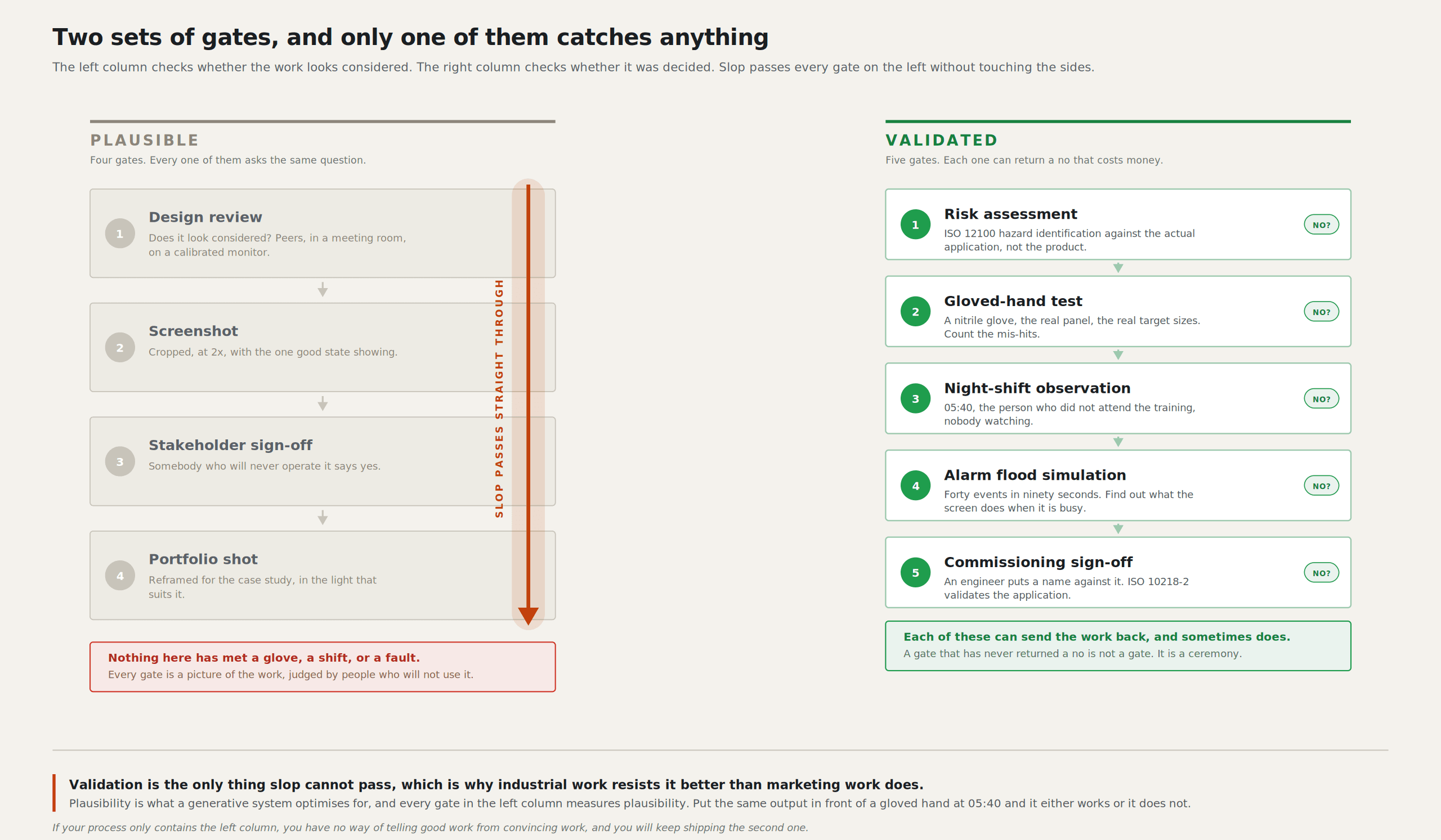
The evidence that plausible and correct are different things is not theoretical. Siemens ran a vision-language-action model on an actual factory floor at Erlangen, picking transparent accessory bags from cluttered bins and inserting them into cardboard package cavities. They adapted a pretrained model, ran 900 episodes in a mock lab and 2,535 episodes on the factory floor across roughly 10 hours. Final success rates fell short of expectations; the run with constraints in place outperformed the less constrained runs, and the dominant failure modes were resolutely physical: bag contents remaining on the product (65%), multiple bags grasped (23%), the bag not fully inserted (15%) (arXiv). Their own stated lesson is that camera placement and hardware ergonomics substantially limit what a policy can perceive and learn.
That is a level one perception failure in a robot, and the fix was not a better model. It was moving a camera. The same is true of the interfaces we put on top of these cells, which is most of what I argue in AI in palletising.
How to build perception on purpose
This is the part I would want if I were twenty-eight and reading this, so I will keep it concrete.
Study failures, not galleries. Dribbble and Behance are training data for producing the median, which is now free. Incident reports, alarm-management post-mortems, accessibility audits, and support ticket logs are where causes are visible. An hour in a support queue teaches more discrimination than a week of scrolling.
Get the output in front of the real user in the real conditions. Not a usability lab. The actual cold store, the actual glare, the actual gloves, the actual 2 am. I have had screens that tested perfectly in Germany fail on the floor for reasons that were invisible on my monitor in Koringberg. Every one of those is now permanently in my perception.
Name the constraint out loud before you generate anything. Write the sentence first: "this screen must be readable at 1.5 metres by someone wearing gloves who has eleven seconds". Then generate. A prompt without a stated constraint asks for the median, and you will get it.
Keep a written record of what you were wrong about. This is the one almost nobody does, and it pays back more than the other five combined. I keep a running list of decisions that turned out badly, with the reason. It is unpleasant reading, which is the point. Taste that is not written down decays into confidence.
Study one medium at a time, deliberately. Because taste is specific, general exposure builds nothing in particular. Spend three months only on typography in dense data screens. Then three months only on easing curves and timing. Broad, shallow exposure produces the feeling of taste without the discrimination.
Use the machine for options and spend the saved time on selection and testing. If generating twenty variants takes four minutes instead of four hours, the honest use of the surplus is not twenty more variants. It is putting three of them in front of an operator. The bottleneck moved from production to judgement, and most people have not moved their time to match.
What I actually let the machine do
I use these tools every working day. Firefly, Cinema 4D 2025 and 2026 with Redshift, After Effects, Framer, Figma. I am not making an abstinence argument, which would be both dishonest and useless.
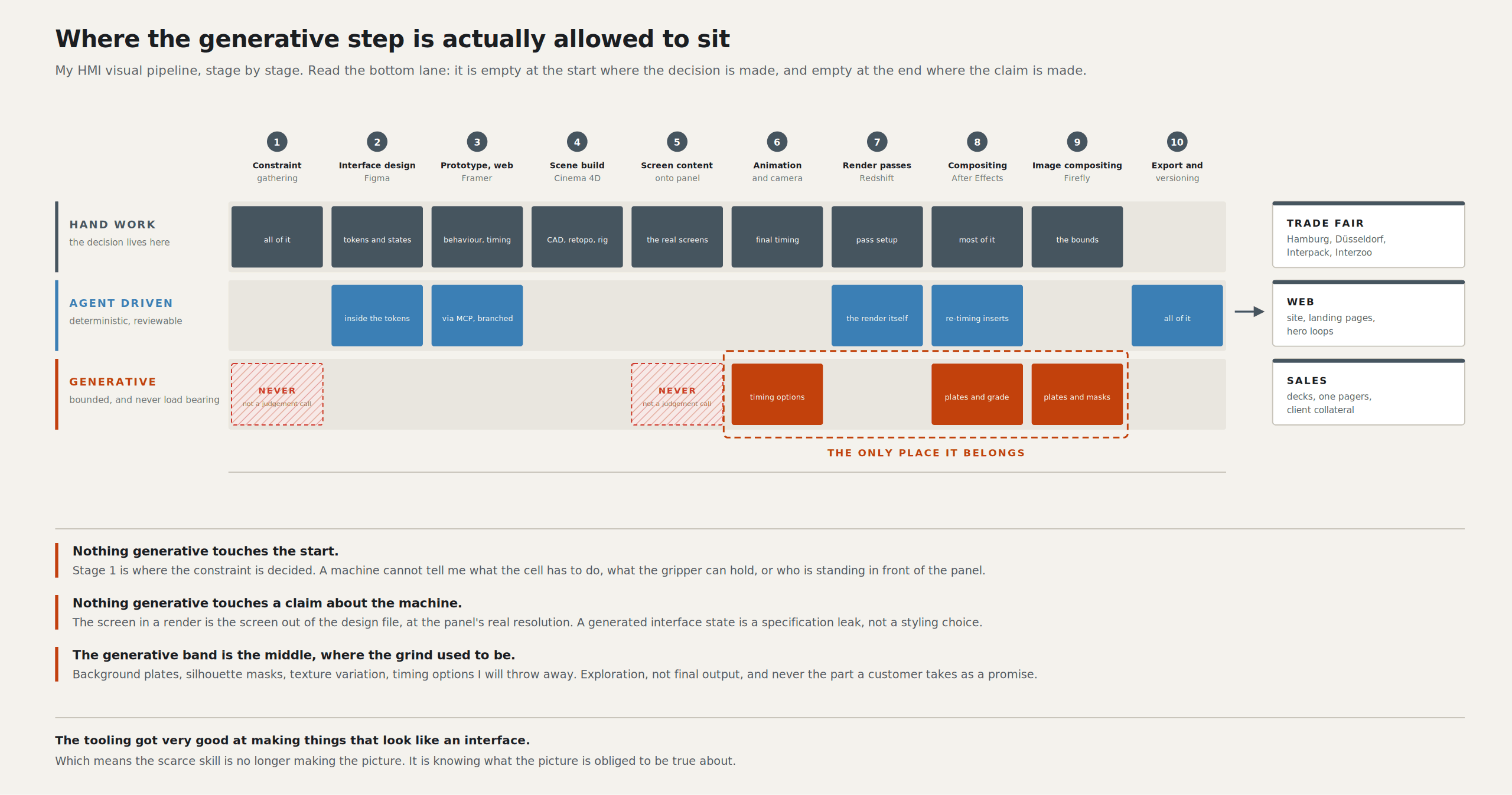
My rule is about where the cost function lives. If the cost function is external and cheap to check, I let the machine run. If the cost function lives in my head and checking it is expensive, I do not.
External and cheap to check: background plates and textures in Firefly, because I can see immediately whether a surface reads as anodised aluminium. Layout variants in Framer, because I can measure the result. Rough motion timing, because I can watch it and know within two seconds. Copy variants for a trade fair panel, because the constraint is character count and I can count.
Internal and expensive to check: alarm hierarchy, state model coverage, anything that touches a safety function, the order in which information appears during a fault, and the question of what an operator is allowed to do without confirmation. These are all decisions whose failure mode only shows up in a situation that has not happened yet. A generated answer will be plausible; I will have no fast way to falsify it, and my own perception will be biased towards accepting something that looks like the interfaces I already know. That is the exact condition under which slop enters a serious system.
I hold that line hard across all three interfaces I work on: the engineering side, cell configuration, and the operator screen. The operator screen gets the strictest treatment, because the person using it did not choose to be a software user and cannot be assumed to recover from my mistake. How I make the underlying automation logic legible on those screens is its own subject, and I have written it up separately in Making Automation Heuristics Legible.
The IFR's own trends outlook for 2026 puts AI and autonomy first among the five forces reshaping robotics. It puts safety, standards alignment and liability fourth, with an explicit note about cybersecurity risk from cloud-connected AI (IFR). Those two trends are in direct tension, and the tension is resolved by people who can tell the difference between an output that is plausible and an output that is right. That is the job now.
The question that should bother you
I hear the taste argument made most confidently by people whose portfolios would survive being generated. That is worth sitting with.
So the test is not whether your work looks AI-generated. Surface is settled, and you will lose that argument eventually on the surface alone. The test is whether anyone would notice if it were. If your last project were regenerated from its own brief tonight by a model that never met the client, never stood on the floor, never watched anyone use anything, would the difference show up anywhere other than in your own attachment to it?
For most of the campaign work I did in my twenties, the honest answer is no. For a palletising interface that a shift worker has to read in eleven seconds with cold hands, the answer is yes, and I can tell you precisely which decisions would go missing. That gap is the only thing worth building a career on.
Sources
Merriam-Webster's word of the year for 2025 is AI's "slop" (PBS NewsHour)
Endsley, "Toward a Theory of Situation Awareness in Dynamic Systems", Human Factors (SAGE)
Updated ISO 10218 FAQ (Association for Advancing Automation)
Deploying a vision-language-action model on the factory floor (arXiv)
Figma Config 2026 recap: motion, code, shaders, AI (ExplainX)
Leon Potgieter designs HMI and visual systems for industrial robotics. He has spent the last five years as the visual systems designer for Unchained Robotics in Germany, working on the operator, configuration and engineering interfaces behind the MalocherBot cell.