Most brand work is built for the first ninety seconds, not for five years. The interface faces the hardest constraints, so it should set the rules.
Two people who never meet
A production manager walks a hall, talking about automation in Hamburg. She has maybe ninety seconds for us: forty seconds of a cell animation, a printed sheet, half a conversation with a sales engineer, then four metres to the next stand. Six months later she reads our website properly for the first time. Then procurement, a specification, a commissioning window.
Eighteen months after the fair, a cell lands on her floor. The person who touches the panel at 05:40, every shift, for the next five years, was in none of those rooms and never saw the animation. He has a glove on his right hand, and eleven seconds before the next case arrives.
One company. Five media. Three years. Two entirely different people: one with all the purchasing power and almost no exposure, one with all the exposure and no purchasing power at all.
Almost all brand work is built for the first ninety seconds, not for the full five years. The fix is not more consistency policing. It is deciding which end of the system is the source.
The system is running backwards.
Normally it goes like this. Marketing settles the identity, an agency builds the site from it, a contractor builds a stand from the site, and later on somebody is asked to "apply the brand to the software", which means taking a colour chosen against a white website background and putting it on a 10-inch panel in a hall with high-bay lighting and a skylight. That produces incoherence with total reliability, and not because anybody was careless. The constraint gradient runs the wrong way, and you cannot derive a hard system from a soft one.
Rank the touchpoints by how much each constrains a visual decision, and the fair wall sits at the bottom: six metres of backlit fabric in controlled light, seen for a few seconds. A printed sheet constrains a little more; a website more again.
The operator panel constrains nearly everything. Fixed resolution on hardware specified eight years ago and not replaced. Glare from a skylight that tracks across the screen through the day. A viewing distance of 1.5 metres, and a gloved hand, so touch targets have a floor. Then there's what makes industrial HMI different from every other kind of interface work: under high-performance HMI practice, saturated colour is reserved. It carries abnormal and safety states, nothing else.
This can mean that a company's own brand colour is forbidden as an accent on its own product. If your corporate orange sits near the amber you use for a warning state, the correct decision is to omit the orange from the operator screen. Not smaller, not tinted, not as a border. Gone, because somebody glancing at that screen from 1.5 metres has to treat colour as information, and a decorative use of the same hue poisons that channel permanently. No brand system I built in twenty-five years of campaign work had to survive its own primary colour being banned from the product. Industrial ones do.
Design the system at the panel, and it relaxes outward to a website and a fair wall without breaking. Design it in a marketing deck, and it meets a panel at 14:00 with the sun on it, and dies.
A system born at the softest constraint gets an exception when it meets the panel, and an exception is where coherence goes to die.
The second reason is commercial. Count contact hours. A visitor sees the stand for ninety seconds. A buyer reads the website over maybe an hour, spread across a year. An operator looks at the interface for six hours a shift, 230 shifts a year, for five to eight years. By a wide margin, the interface is the company's highest-frequency brand contact, and the only one where being wrong costs downtime or injury rather than bounce rate. At almost every automation company I have seen, marketing ignores it.
Coherence has to be testable, not felt.
"Brand coherence" survives as a phrase because nobody defines it, so every review becomes an argument between two people's feelings. The most useful definition comes from the Ehrenberg-Bass Institute's work on distinctive brand assets, drawn from Byron Sharp's How Brands Grow and codified in Jenni Romaniuk's Building Distinctive Brand Assets. It puts an asset on two axes. Fame: how many category buyers correctly link it to your brand when the name is not shown. Uniqueness: how exclusively it links to you rather than also cueing competitors. Both are measured with an unbranded recognition task (Ehrenberg-Bass distinctive brand assets framework).
High fame with high uniqueness gives you core assets to protect. Low fame with low uniqueness gives you things that are not assets at all, whatever the brand book says. The framework goes well past logos: colour systems with dominance ratios, shapes, layout motifs, iconography, typography, motion patterns. A 2026 benchmarking study in the International Journal of Advertising found shape-based assets the strongest performers across industries (Taylor & Francis). Layout motifs and motion are interface properties, so the distinctive asset inventory of an automation company includes things that exist only inside the software, and that no marketing department has ever audited.
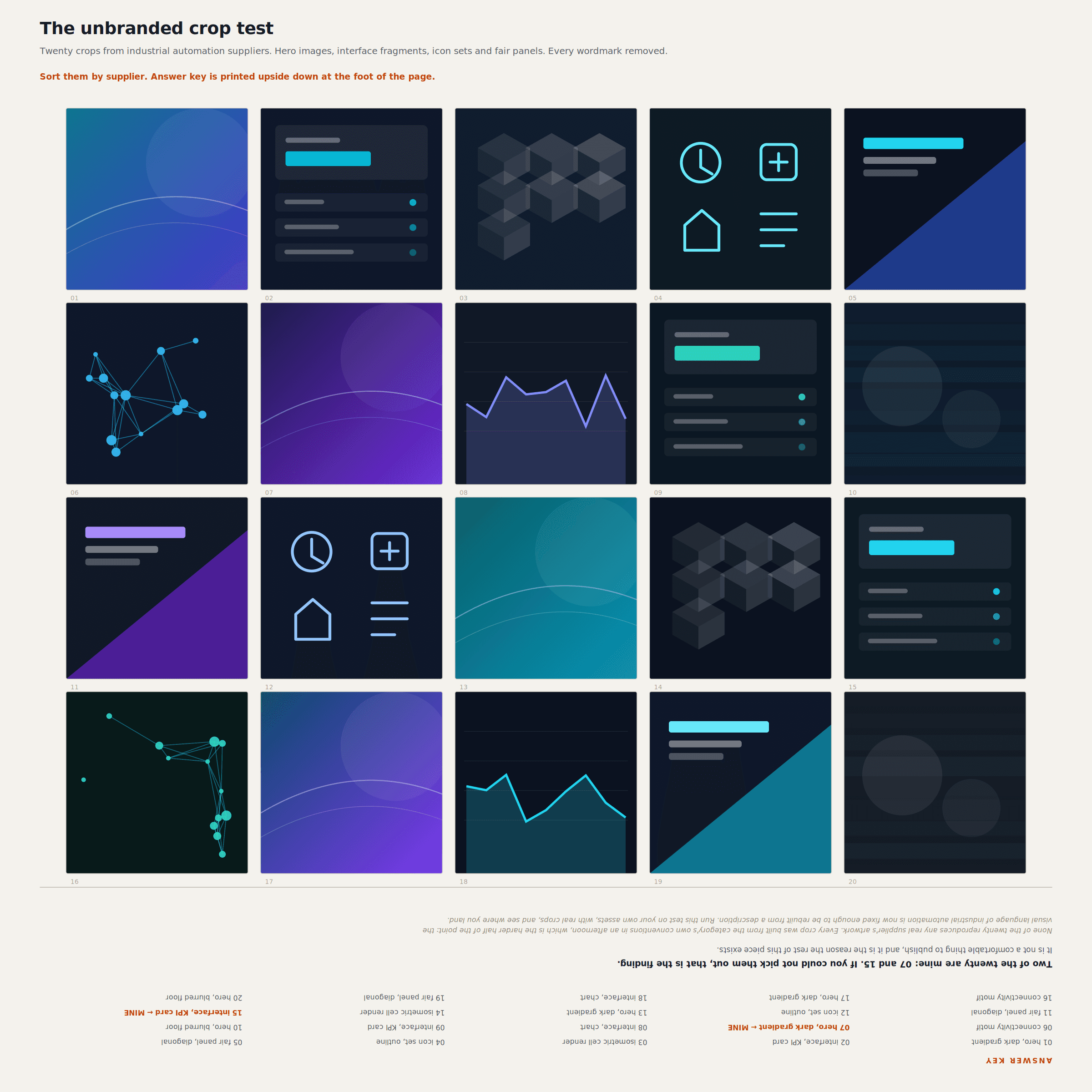
Industrial automation fails unbranded recognition badly, as an entire category. Open ten competitor sites, and you find the same dark hero section, the same three-quarter isometric cell render with a cyan rim light, the same blue-to-violet gradient, and a headline that is some permutation of "orchestrate your automation". Crop the heroes, remove the logos, and nobody can tell them apart. Not customers, not the companies' own staff.
That convergence predates AI by a decade. It came from everyone hiring the same agencies, buying the same stock renders and copying the same reference sites. Generative tooling took a slow drift and put an accelerator on it.
Consistency got cheap, distinctiveness got expensive.
Two mechanisms are pushing here, and they get conflated constantly.
The first is supply. The cost of producing an off-system asset fell to roughly zero while reviewer capacity did not move. A regional sales engineer who needs a slide for Thursday used to reach for the template or wait for design. Now he generates something that looks fine in four minutes, and there are forty of them.
Notice where that enters: not through the website, which is watched, and not through the fair stand, which has a sign-off. It comes through sales decks, proposal covers, and internal presentations forwarded to customers: the surfaces with the most authors and the least review. Volume overwhelms the gate. Why that output is so hard to catch is a subject of its own, since slop is output with the surface features of a decision and no decision underneath (taste and perception).
The second mechanism is convergence, and this half has real evidence behind it. A group at Dalarna University in Sweden ran a visual telephone game between two models and published it in Patterns in December 2025. Stable Diffusion XL generated an image from a prompt. LLaVA described that image in words. The description went back to the generator to make a new image. Round and round, from 100 diverse prompts, 100 exchanges in the main experiment and extended runs reaching 1,000 loops (Patterns, Cell Press).
The systems collapsed onto twelve recurring visual themes. Twelve. Gothic cathedrals, natural landscapes, sports imagery, urban night scenes, stormy lighthouses. Convergence happened around the hundredth iteration and then held, sometimes jumping to a different generic motif in longer runs but never reopening into variety (EurekAlert). The lead researcher, Arend Hintze, put it plainly: "They're not going to make Picasso's Guernica because that needs a lot of intentionality and creative input."
That is a laboratory setup with no human in the loop, and the honest question is how closed your own loop is.
The broader evidence is more modest, and I am not going to oversell it. A meta-analysis by de Rooij and Biskjaer, covering 19 studies and 61 effect sizes and presented at the European Conference on Cognitive Ergonomics in Siena, found that generative AI makes creative output more homogeneous, with an effect size of d = 0.334 (Tilburg University).
That is a small effect, and I want to be exact about it. It held up under sensitivity checks and wasn't attributable to publication bias, but it is small, and it doesn't mean your next generated asset is ruined. Anyone quoting that number as proof that AI destroys creativity is doing the thing this article complains about. The authors call it a reorganisation of creative diversity rather than a loss, and note that the cumulative effect only becomes meaningful when millions adopt comparable systems at once. Scale is the argument: a small per-output push toward the centre, applied across every supplier in a category at once, moves the category. Individually invisible, collectively the reason those ten tabs look identical.
So the economics inverted. Consistency used to be the expensive discipline, policed with 60-page guidelines and somebody whose job was emailing people about logo clear space. A distinctive idea was cheap: one art director, one afternoon. Now anyone can generate a thousand consistent-looking assets by lunchtime, and none are recognisably yours.
The mechanism: what actually holds a system together
Six things, all of which you can start on Monday.
Tokens, not a PDF
A style guide is advisory: a document a human is supposed to have read and remember under deadline pressure at 17:40. A token file is enforceable, read from one source by a build pipeline, a design tool, and an agent alike.
That stopped being aspirational in October 2025, when the W3C Design Tokens Community Group's Design Tokens Format Module reached version 2025.10, its first stable version. It covers multi-brand theming, including accessibility variants; modern colour spaces, including Display P3 and Oklch; token relationships through inheritance and aliasing; and cross-platform code generation. More than ten tools support or are implementing it, including Figma and Framer (W3C Design Tokens Community Group). Both are in my daily pipeline, so the constraint now lives in one file that follows the work from the operator screen to a landing page for a fair.
The shape I run: one token set at the root, with the operator layer as the most restricted subset. Alarm and warning colours are defined once, aliased everywhere, and illegal outside their component. The marketing layer inherits from the root and may import decorative tokens the operator layer cannot. Not a second palette, an extension of the first, which is the difference between one system and two with a family resemblance.
A written philosophy, not just a rule list
Tokens say what is allowed. They cannot say why, and why is the only thing that lets anybody extrapolate correctly to a case the guide never anticipated.
Process industries settled this decades ago. ISA-101.01-2015 requires an HMI philosophy document as the foundation of the whole lifecycle, with supporting technical reports on philosophy and on usability (ISA). It states what the HMI is for, who operates it, and what the display hierarchy is meant to achieve. Specific rules are derivable from it.
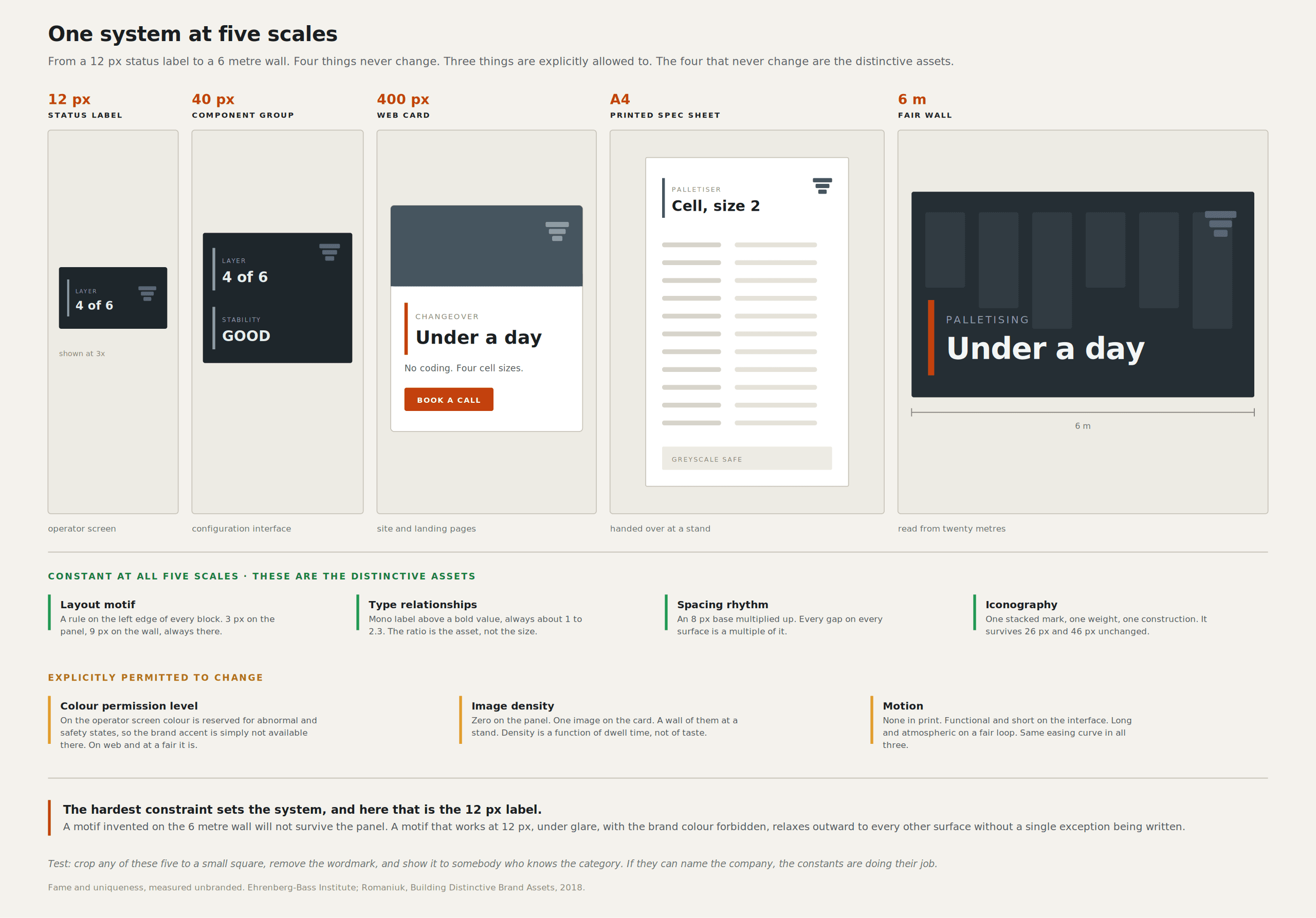
Generalise that requirement to the whole visual system, and you get the company's most valuable document. Ours says things like: colour carries state on any surface where a machine's condition is communicated; therefore, the brand accent is unavailable there; therefore, recognition on those surfaces is carried by layout motif, typography, and iconography instead. That is a reason, not a rule. When somebody hits a case I never imagined- a diagnostic overlay or a partner's white-labelled screen- they can derive the answer instead of guessing.
Rules without reasons produce literal compliance and incoherent output. Someone follows the letter of your spacing scale, produces something never seen in your system, and is not wrong, because you never said what the scale was for.
A second payoff didn't exist five years ago. A style guide used to be something a team ignored after month three. The philosophy document is a file you attach to an agent, apply to every request without fatigue, and cover in the AI tooling I actually use.
A hard prohibition list
The philosophy says what to do. A separate, blunt list says what is never generated: interface states that do not exist in the build, robot poses that are kinematically impossible for the arm named in the caption, gripper and payload combinations the hardware cannot hold, any safety indication, any cycle time rendered as screen content, any pallet pattern that would not survive transit.
The full argument belongs to the tooling article, which owns the point that a generated picture of an HMI is a claim about a machine rather than an illustration. What matters here is that the list is a brand document, not just an engineering one. Every item on it, when it goes wrong, damages credibility in a way no visual consistency repairs. Keep it to one page, and put it in the deck template, in the agent's context, and on the wall at the stand build.
Asset provenance
Every asset in the library carries three things: where it came from (generated, hand-built, rendered from CAD, photographed on site), whether it has been checked against the current build, and whether it is approved for customer-facing use.
It takes fifteen seconds per asset, and it is the only way I know to stop the failure where a plausible generated render appears in a pitch deck in March, reaches the website in September, and a year later sits in a specification somebody is holding you to. An asset with no provenance is not in the library. It is a file in somebody's downloads folder, and it goes unused.
One person who sees all of it
Coherence is a single-reviewer output, not a process output, and I have not seen a counterexample in twenty-five years. It is not the sum of local conformance. Every asset in a set can pass its own checklist, and the set can still feel like four companies, because the properties that create recognition, rhythm, the ratio of one colour to another, how motion decelerates, are relational. They are visible only to somebody holding all of it at once.
That is where "you work with me directly, no handoffs, no juniors, no agency telephone game" stops being a line on a website and becomes an argument. Whoever set the density of the operator alarm list is the same person deciding how much white space the fair wall gets, and that relationship is the system.
It does not scale. One person can hold a system this size across three interfaces, a website, fair collateral and an animation library, and cannot hold it across eleven product lines in six languages. The scaling mechanism is the philosophy document: you convert one person's compressed judgement into something a tenth person can derive from—Lossy, and better than the alternative.
Run the crop test on a schedule.
Quarterly, half a day. Take twenty assets from across every touchpoint, including screenshots from the interfaces, crop them to squares, strip the wordmarks, add five competitor assets treated identically, and put the grid in front of eight people who know the category and do not work for you. Cheap, brutal, and the only test that measures whether anybody can tell it is you. Brand audits measure whether you followed your own rules, a much easier question to pass.
Track two numbers over time: the share correctly attributed to you, and the share attributed to a competitor. The second tells you whether the category has swallowed you.
One more practice belongs here. When the tooling saves four hours on variant production, the instinct is to make more variants. Resist it. Put the saved hours into validation: an asset in front of a real operator, a render checked against the build, the crop test. Spent on volume instead, a productivity gain accelerates your drift toward the category mean.
The fair is the stress test.
A trade fair is the only place where every touchpoint collides physically inside ninety seconds. An animation plays, a live panel runs next to it, a printed sheet is in somebody's hand, a salesperson talks over it all, and four metres away a competitor does the same with the same dark hero render.
The scale in Germany is not small. AUMA counted 304 trade fairs in 2025, with 191,990 exhibitors, around 12.75 million visitors, and 6.91 million square metres of exhibition space used, in a country that holds about a fifth of Europe's hall space (AUMA). For a supplier selling automation into Germany, the fair calendar offers the year's most concentrated brand exposure.
The measure that matters there is not leads, which mostly track stand position. It is memory encoding. A visitor walks several halls, sees perhaps eighty stands, and remembers close to nothing by the time they are on the train. The only question worth asking is whether anything survived the journey home, and it has to survive without your name attached, because the name goes first. Four touchpoints sharing a wordmark and nothing else give that visitor four weak competing traces instead of one reinforced one. Nothing encodes.
The live panel is the part most companies get wrong, which is why the inversion at the top of this article is practical, not theoretical. If the interface came from the same source as the wall behind it, the panel reinforces the wall. If the brand was applied late, the panel contradicts the wall from two metres away, and the visitor's eye, grouping whether anybody asked it to, files them as two different things (Gestalt and the AI-assembled screen covers the mechanics).
What coherence costs
Nobody writes this part, so the subject reads as free. Coherence is paid for in refused work: what I have refused: a landing page that wanted the gradient treatment everybody used last year, because adding it there meant adding it everywhere. A fair panel that would have popped in a colour we do not use, in a hall where everything was blue. A campaign concept that would probably have performed better precisely because it did not look like us. Anybody arguing for a brand system who cannot name what it cost this year is arguing from theory.
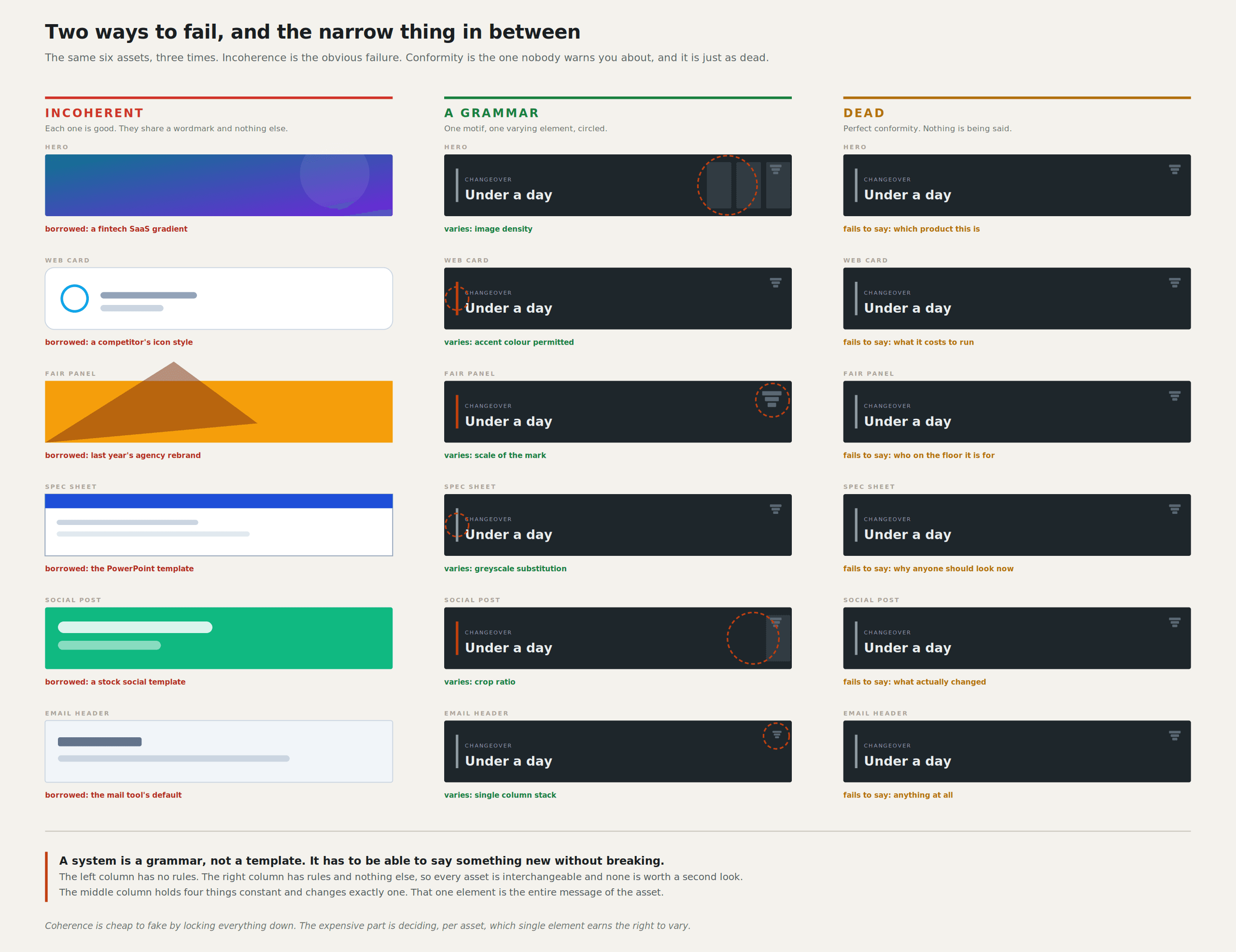
Then there is the opposite failure, at least as common and more boring. A system specified so tightly that nobody can say anything new inside it produces work that is coherent and dead, and it is harder to spot because it passes every audit you have. The symptom is a crop test where people correctly name you and then remember none of it.
The target is a grammar, not a template. A grammar produces sentences nobody has written before, and they still come out recognisably in the language. A template produces the same sentence with different nouns. The difference is whether your philosophy describes intentions or outputs. "Buttons are 8px radius" is a template. "Interactive elements share one radius so touchable and non-touchable are separable at 1.5 metres" is a grammar, because it tells you what to do when somebody invents a new control.
Difficulty rating, honestly: 8 out of 10. Consistency alone is easy and dead; distinctiveness without a system is easy and incoherent; and holding both means refusing things weekly and sometimes being wrong about which refusals were worth it. I find out at a fair, when our own panel sits next to our own wall, and something is off that was not off in the file.
The thing that cannot be prompted
Go back to the two people who never meet. The production manager formed an impression in ninety seconds that she will not be able to articulate eighteen months later but will still be carrying. The operator at 05:40 has formed several thousand since, and nobody has ever asked him about one of them.
Coherence means those two met the same company. Not the same colour. The same company, meaning an organisation that understood one problem, the problem of a person staying in control of a machine, and answered it the same way on a six-metre wall and on a 12-pixel status label. The wall is allowed to be loud, and the label is not, and it is still the same answer.
That understanding is the asset. It is what somebody would have to copy actually to copy you, and it is why the system has to start at the panel, because the panel is the only place it gets tested by somebody who can be hurt when it is wrong. The three interfaces I work on and the firewall in Hamburg carry the same argument at different volumes, and I got it from watching people fail at things I assumed were obvious.
A model can generate a thousand assets that are consistent with each other by tomorrow morning. It cannot generate the reason, because the reason was never written down anywhere except in the system that produced it.
Sources
EurekAlert, press summary of the Dalarna University generative loop study
W3C Design Tokens Community Group, Design Tokens Format Module reaches first stable version
International Journal of Advertising, distinctive brand asset benchmarking study (Taylor & Francis)
Leon Potgieter designs HMI and visual systems for industrial robotics. He has spent the last five years as the visual systems designer for Unchained Robotics in Germany, working on the operator, configuration and engineering interfaces behind the MalocherBot cell.